BitCraft Online at Clockwork Labs
Led UI/UX for a sandbox MMO, shaping the visual identity, component system, and design-to-engineering workflow.
Led BitCraft's UI/UX from visual direction through implementation, building the design system, core game surfaces, and launch marketing assets for a complex MMO spanning inventory, crafting, progression, map, and social systems.
Alessandro Asoni (CTO)
Carter Minshull (Lead Game Designer)
Morgan Nyblom (Art Director)
Lisandro Crespo (UI Engineer)
Challenge
I was brought on to define BitCraft's UI from the ground up. Working directly with the CEO, CTO, Art Director, and Game Director, the team needed a visual direction that felt native to the game's world and narrative while scaling across the broad surface area of an MMO.
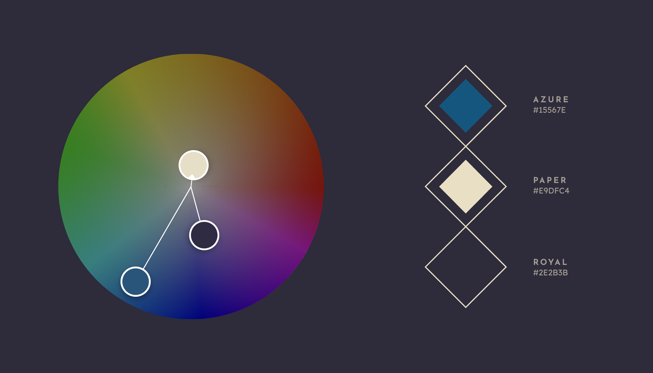
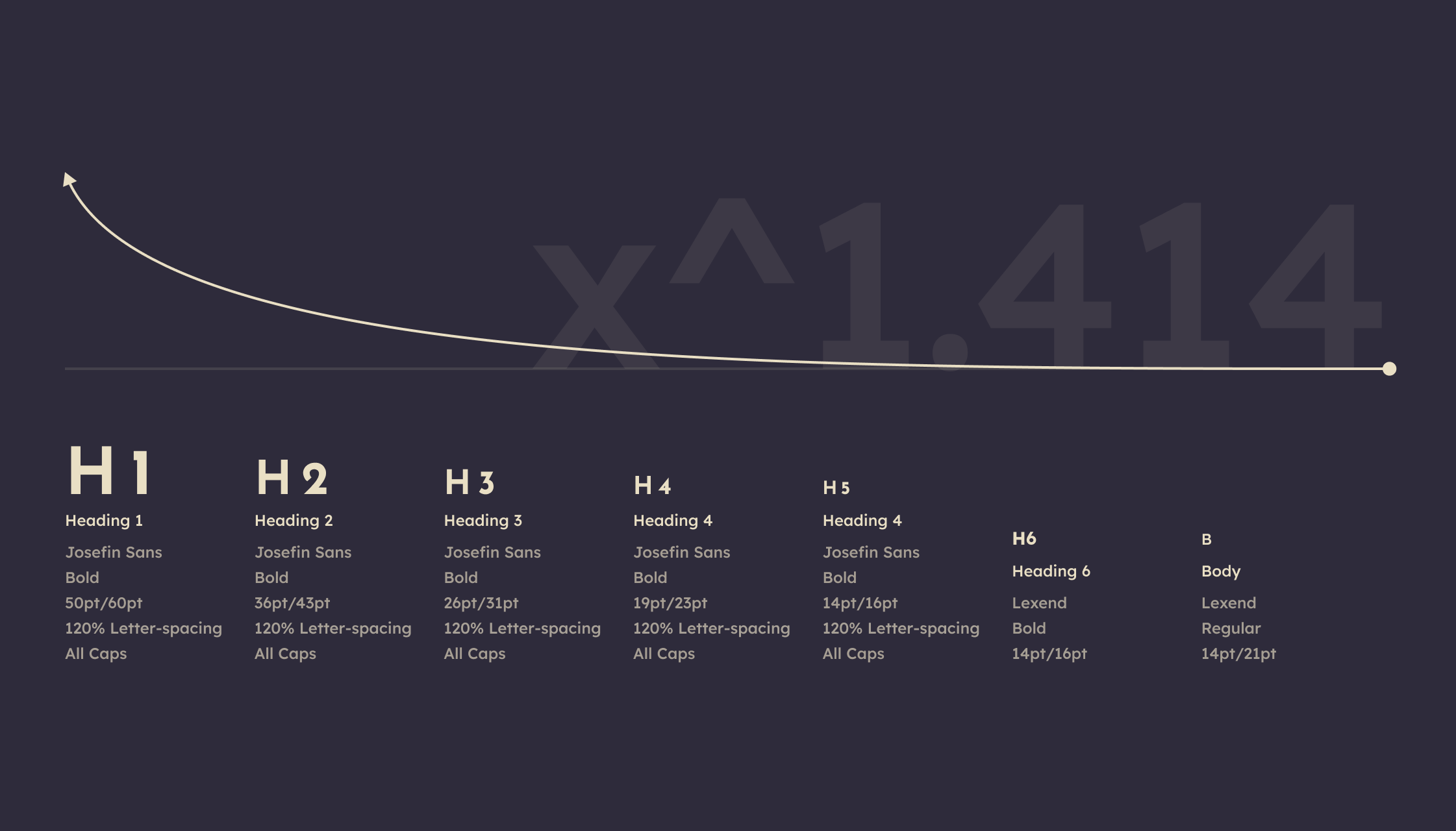
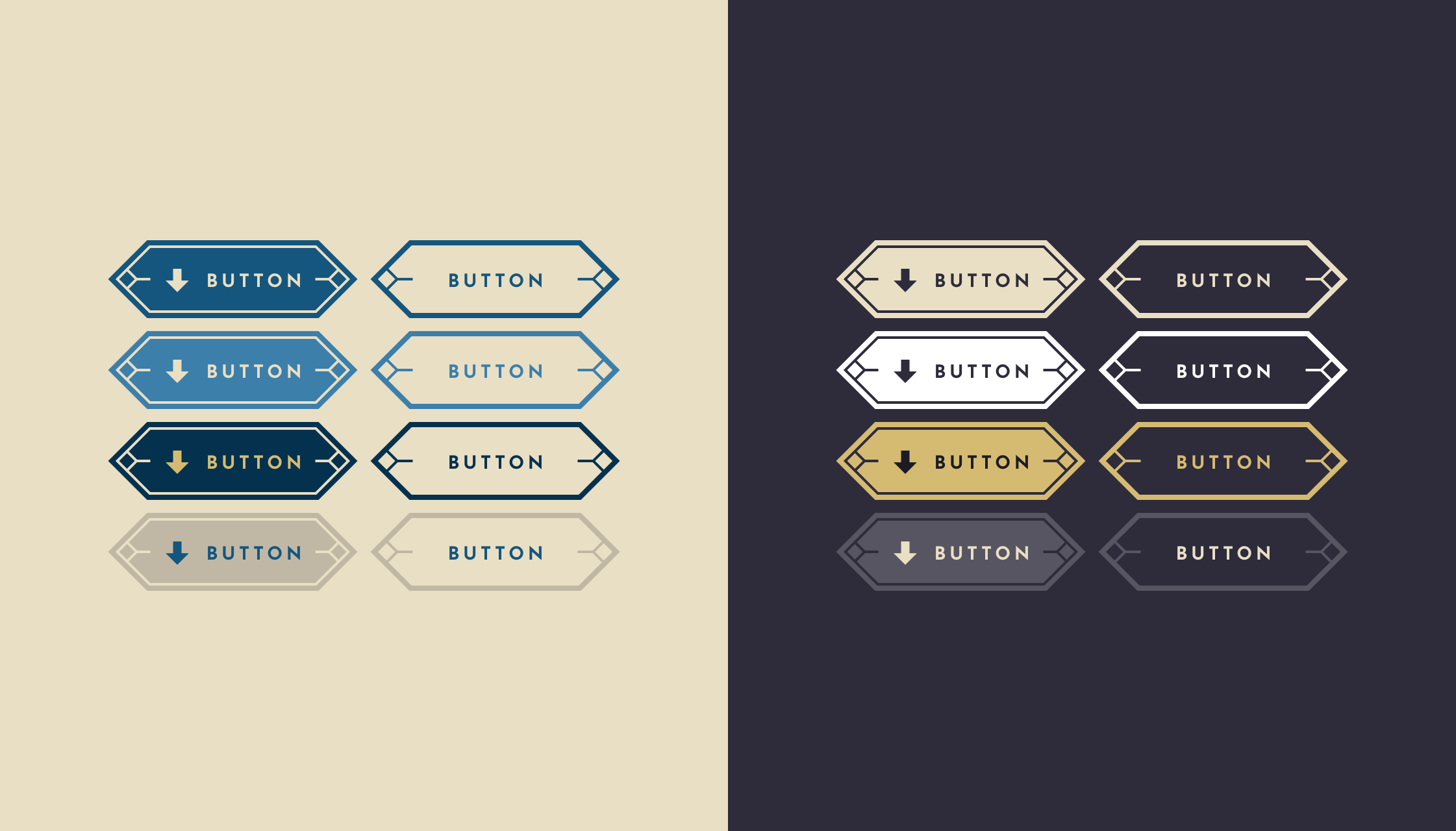
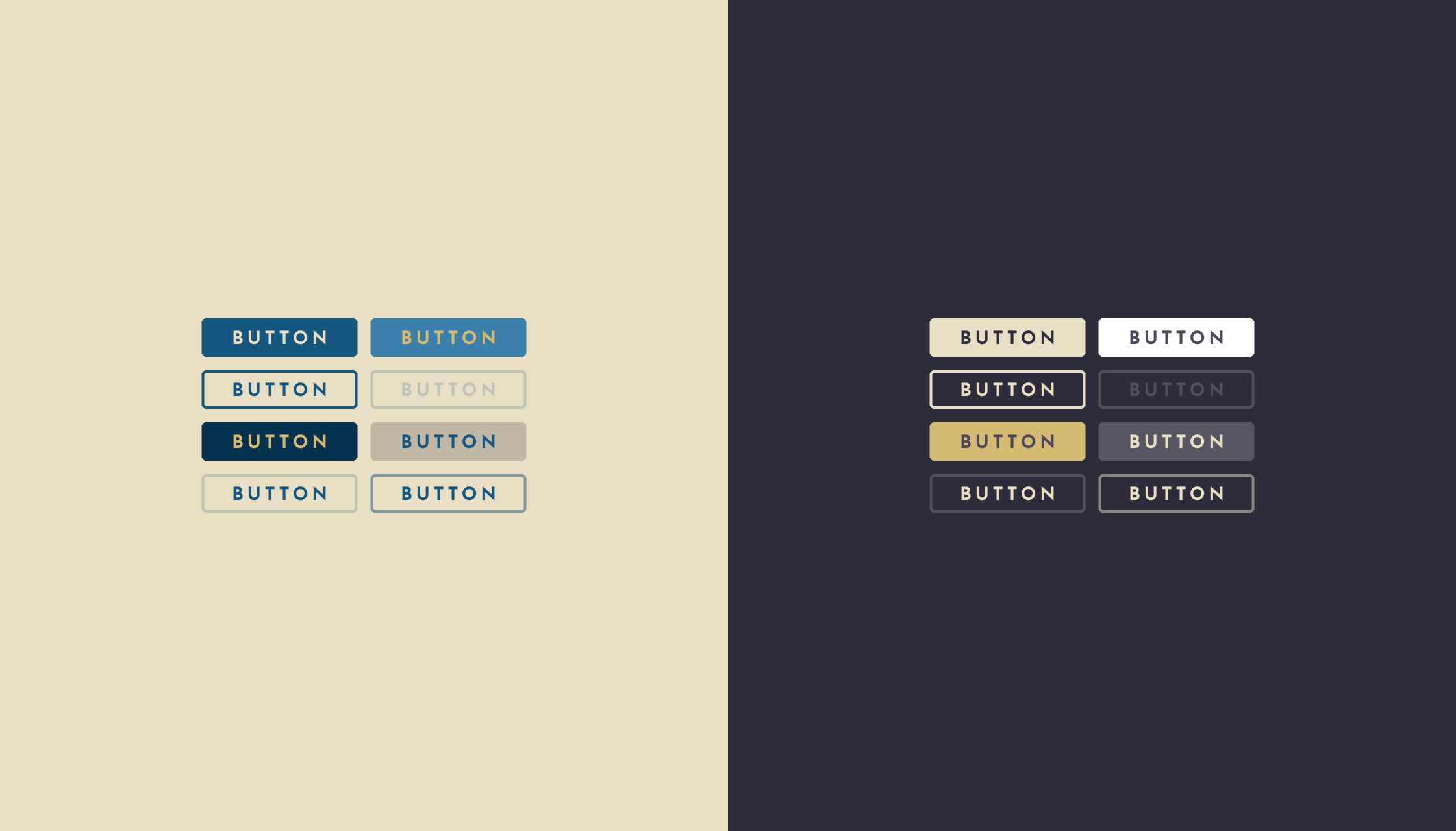
Establishing a Visual Language
The visual direction was developed collaboratively with leadership, refining broad exploration into a shared Art Deco-inspired system that could scale across UI and world-facing assets.
Visual Identity
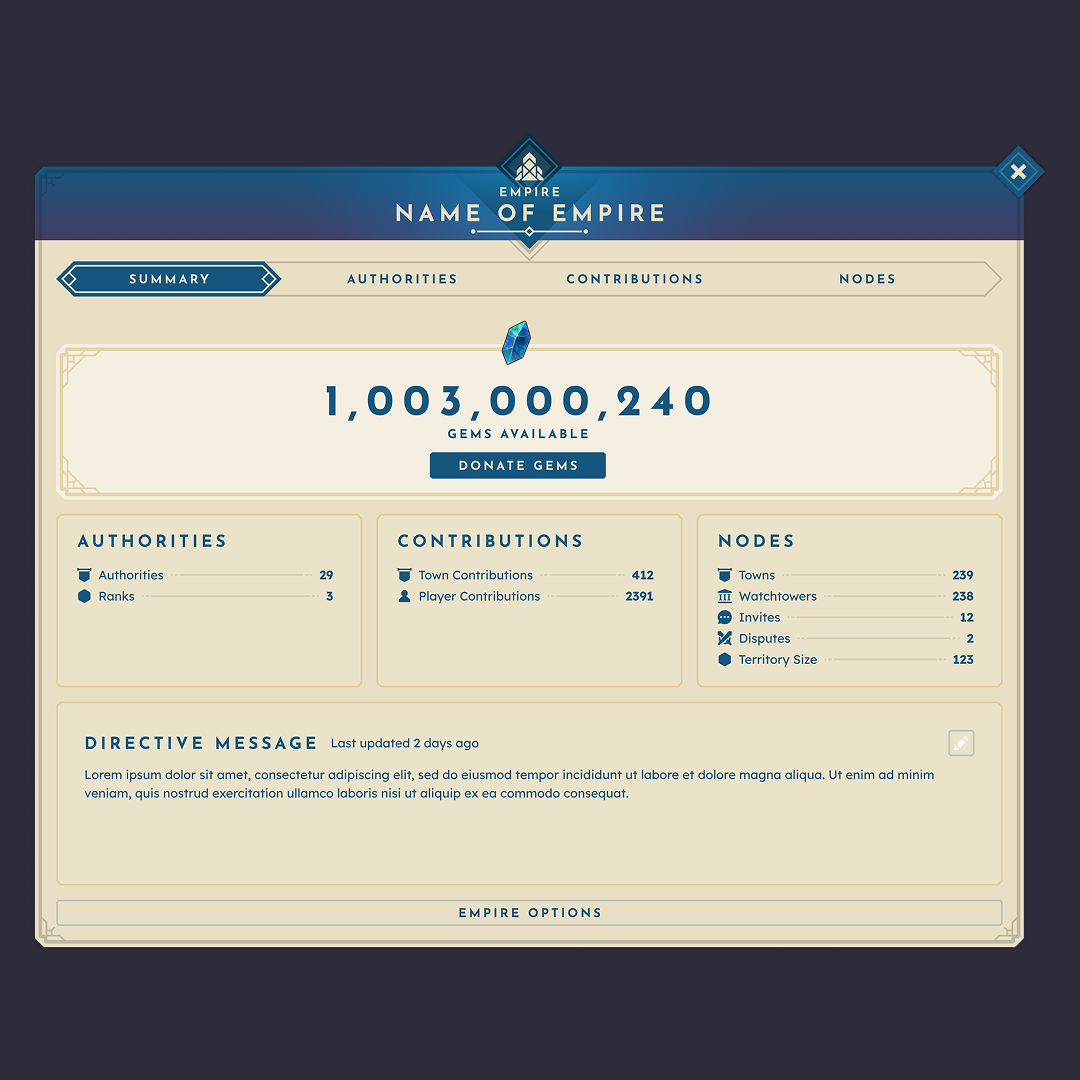
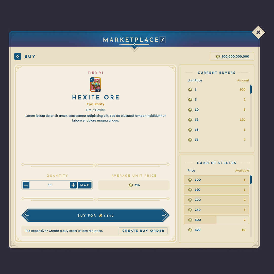
The visual system was built to support density, clarity, and a distinct BitCraft aesthetic.

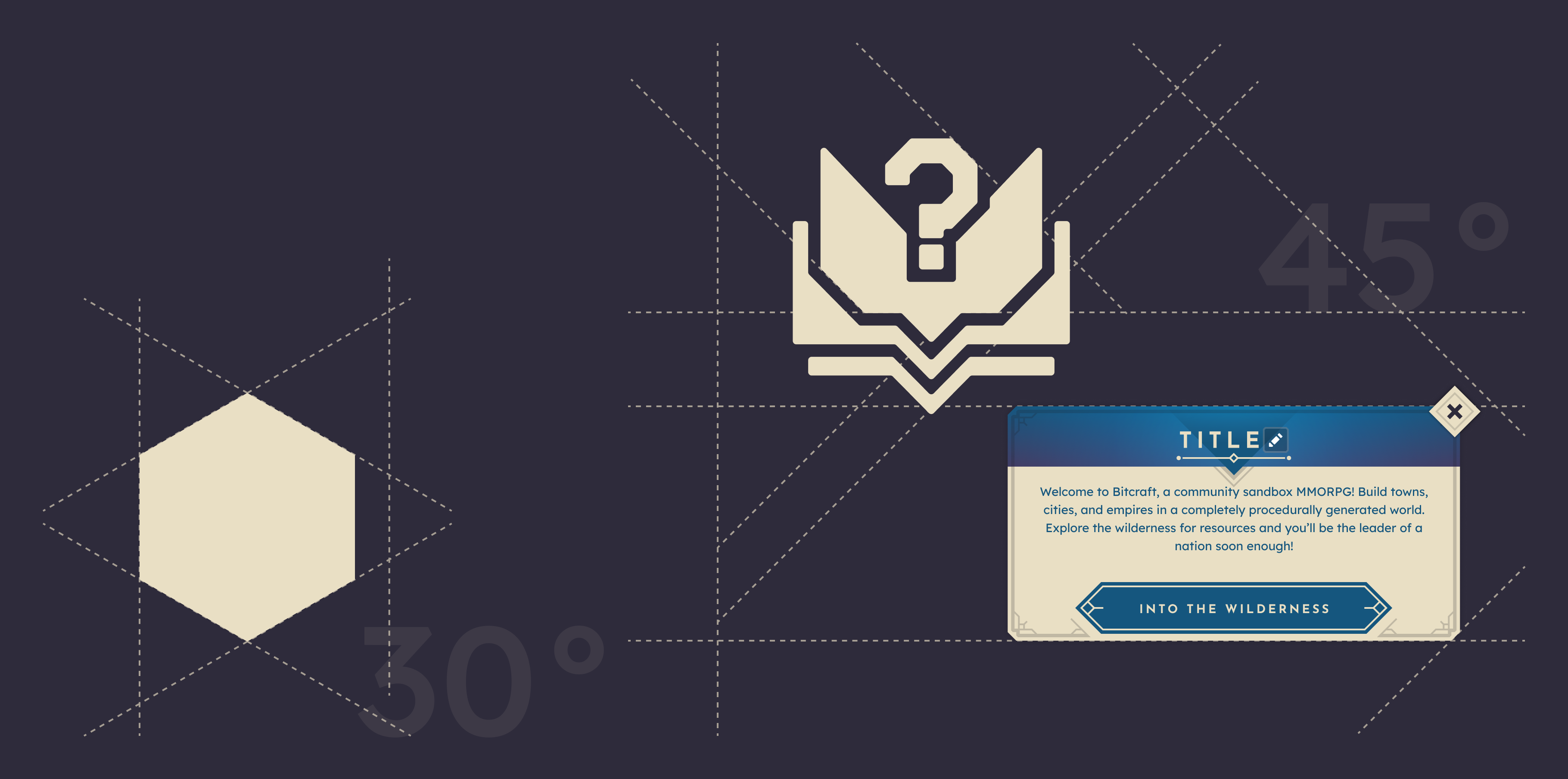
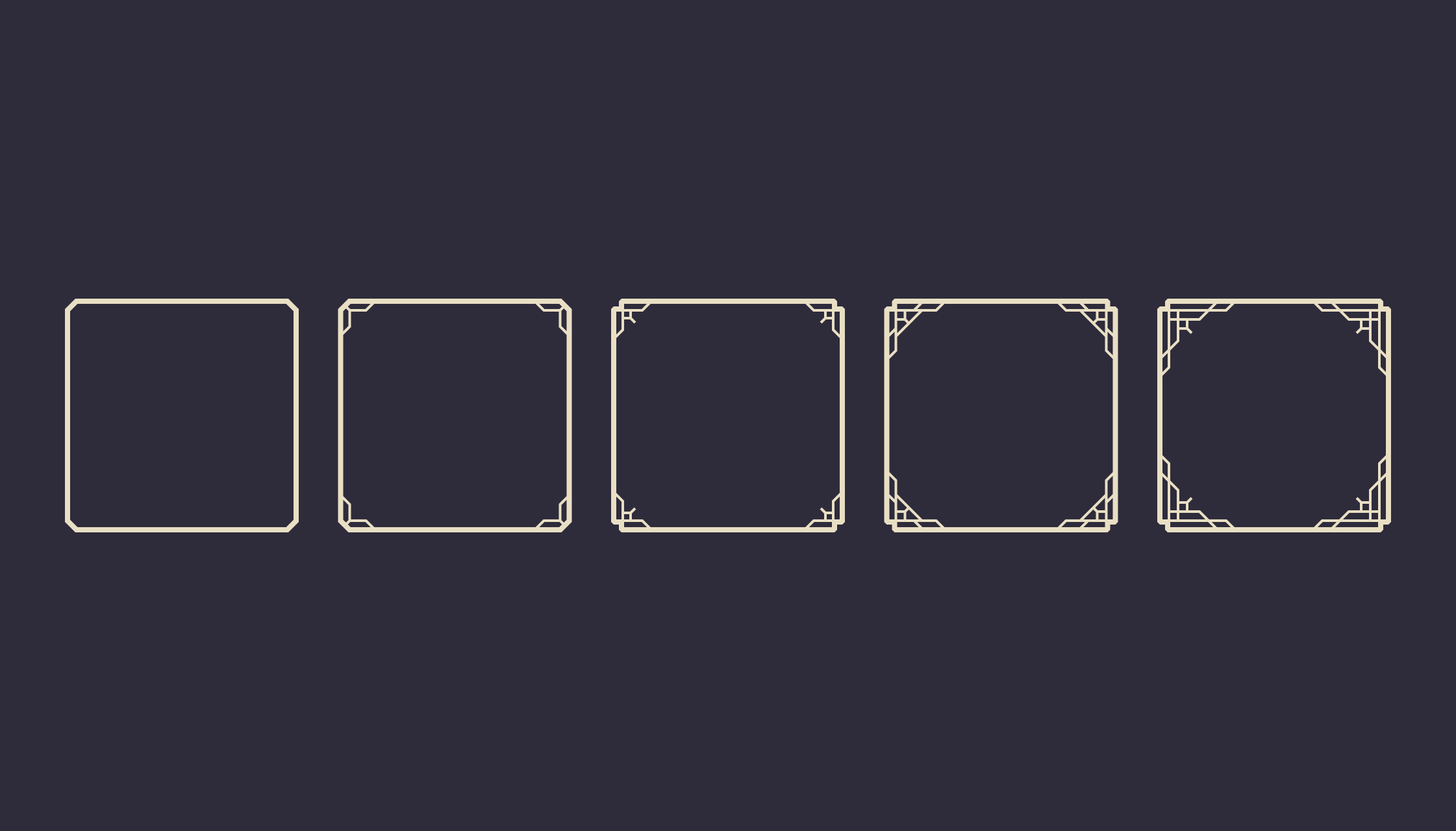
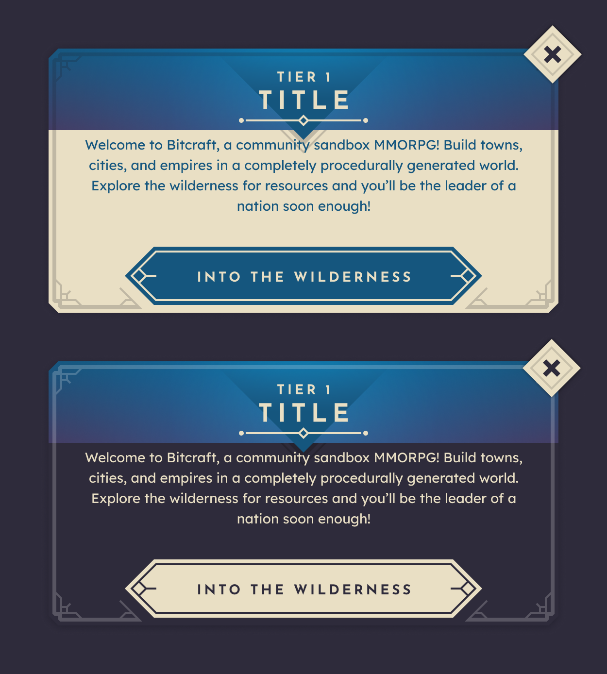
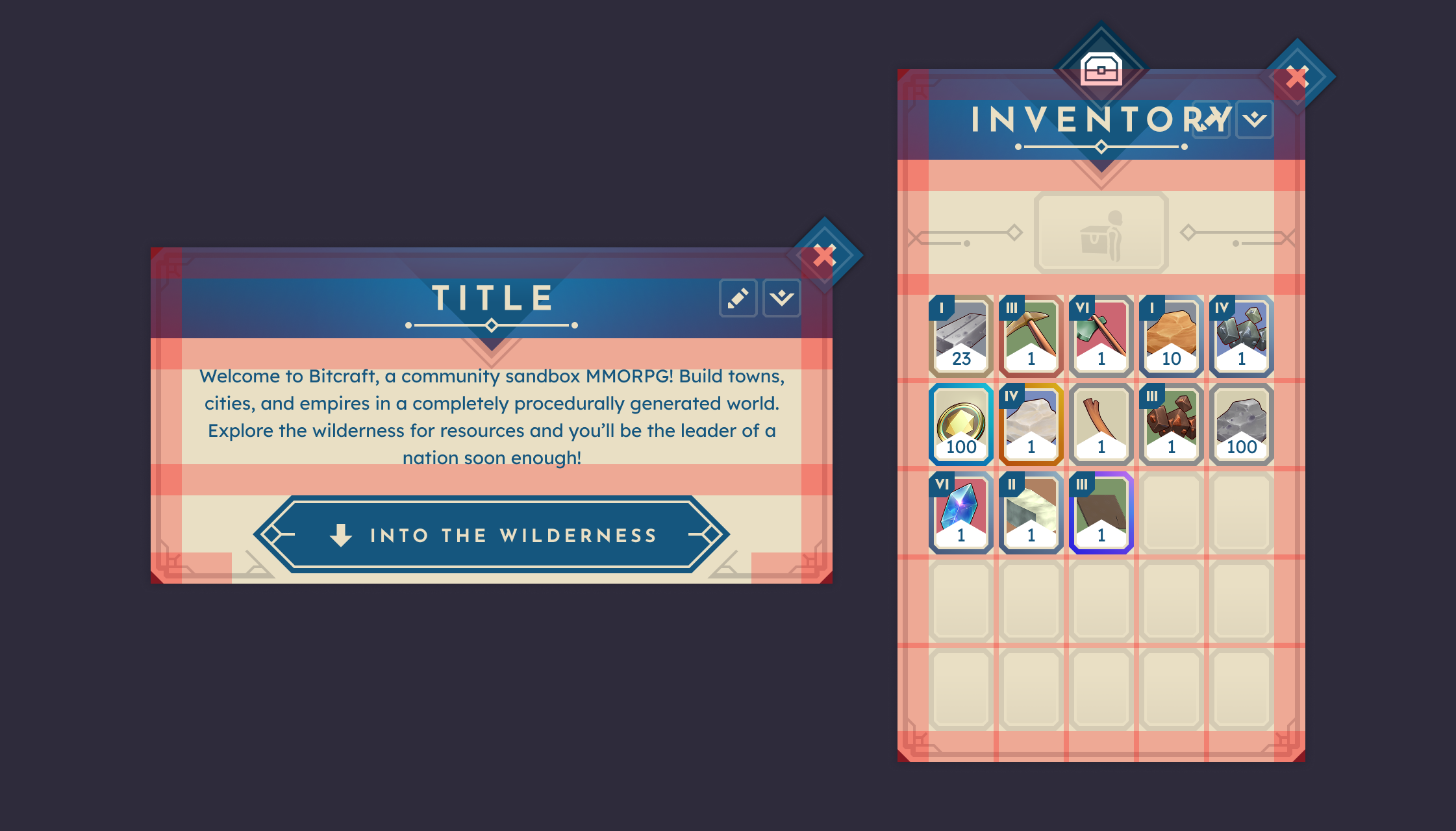
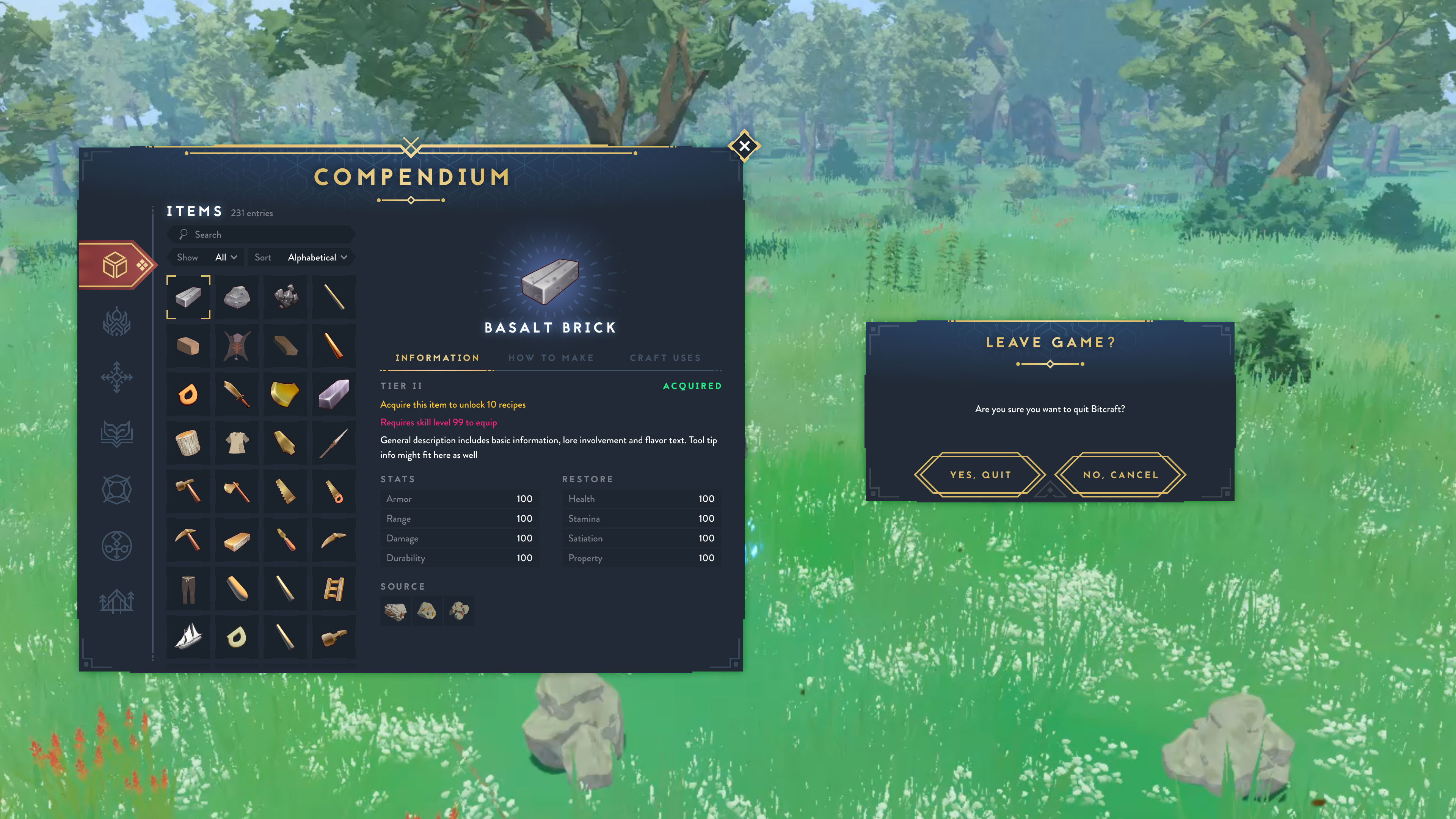
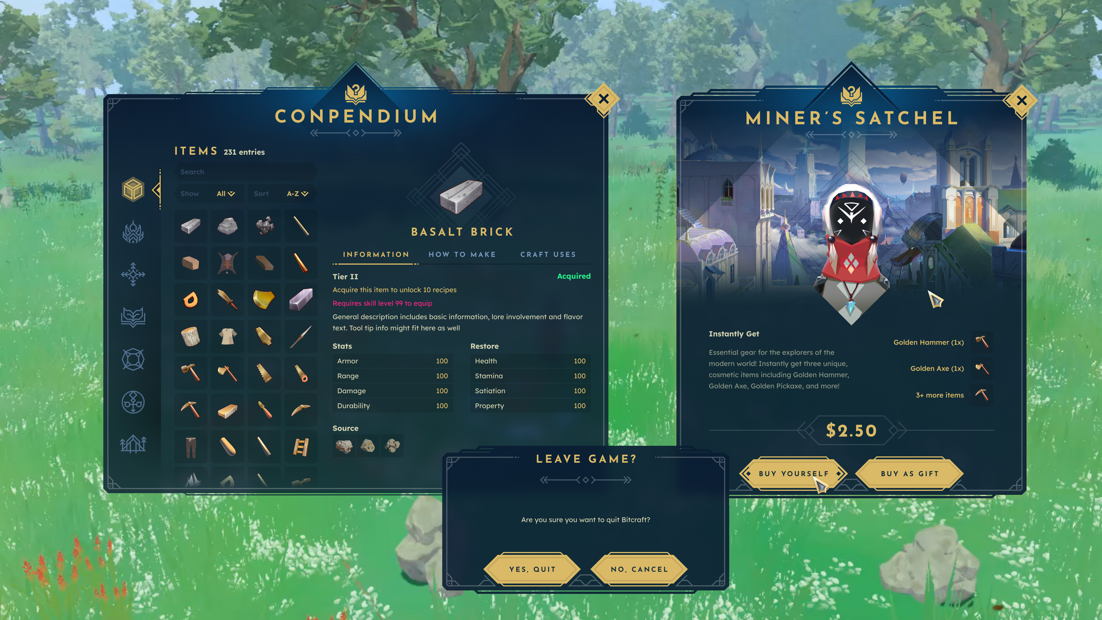
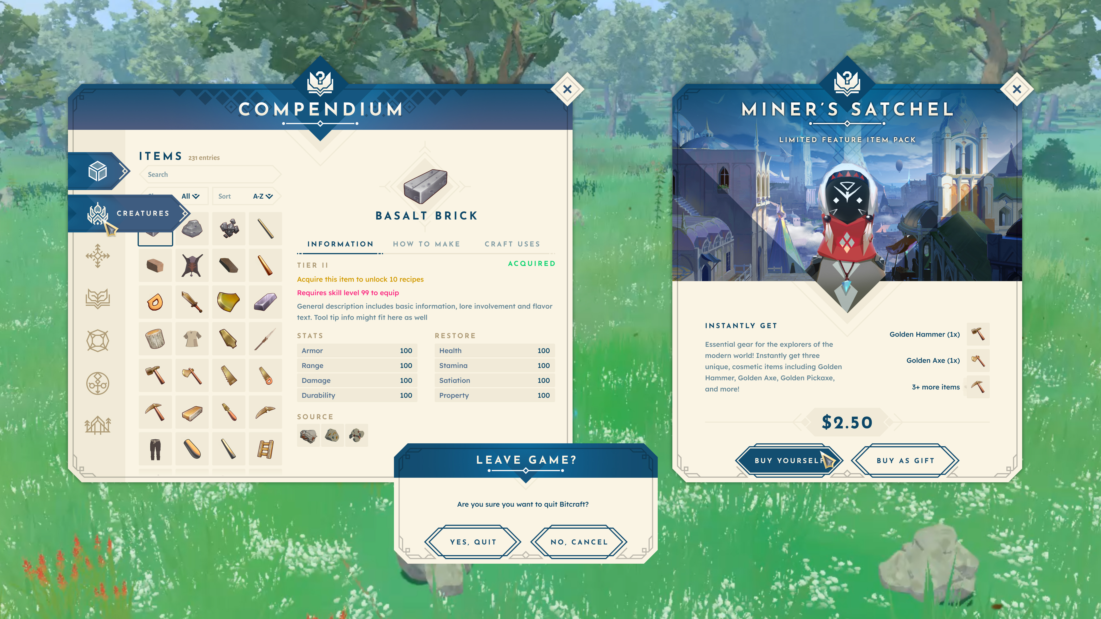
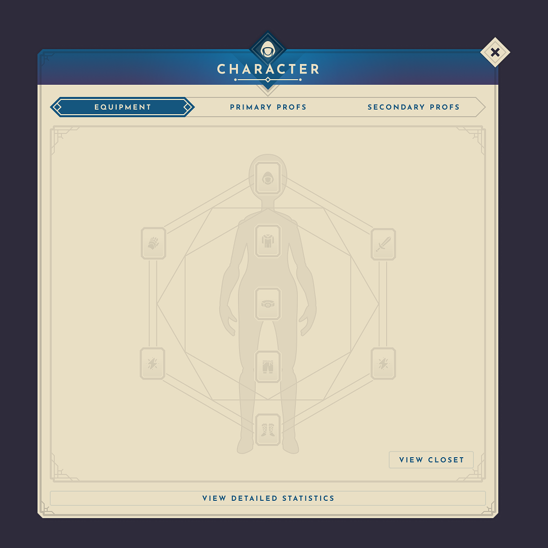
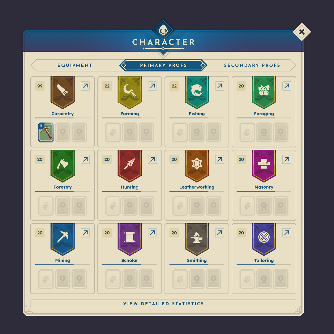
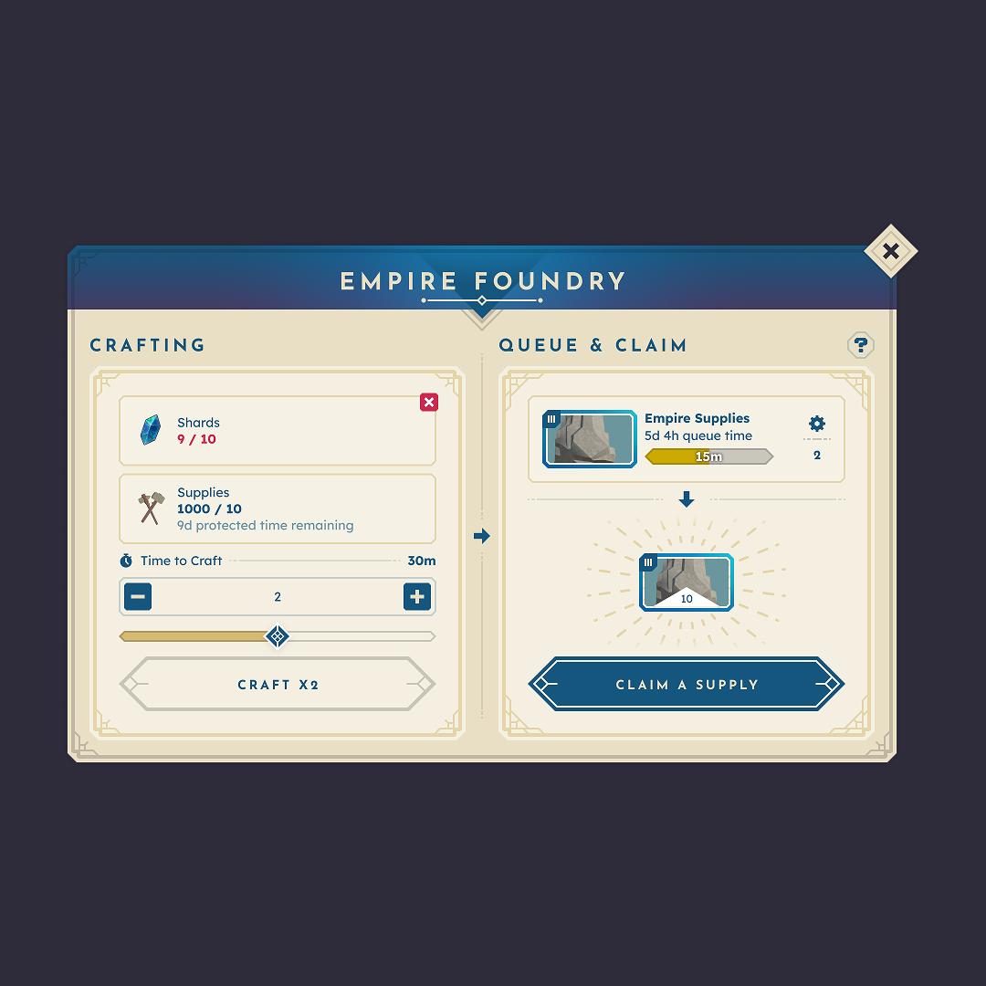
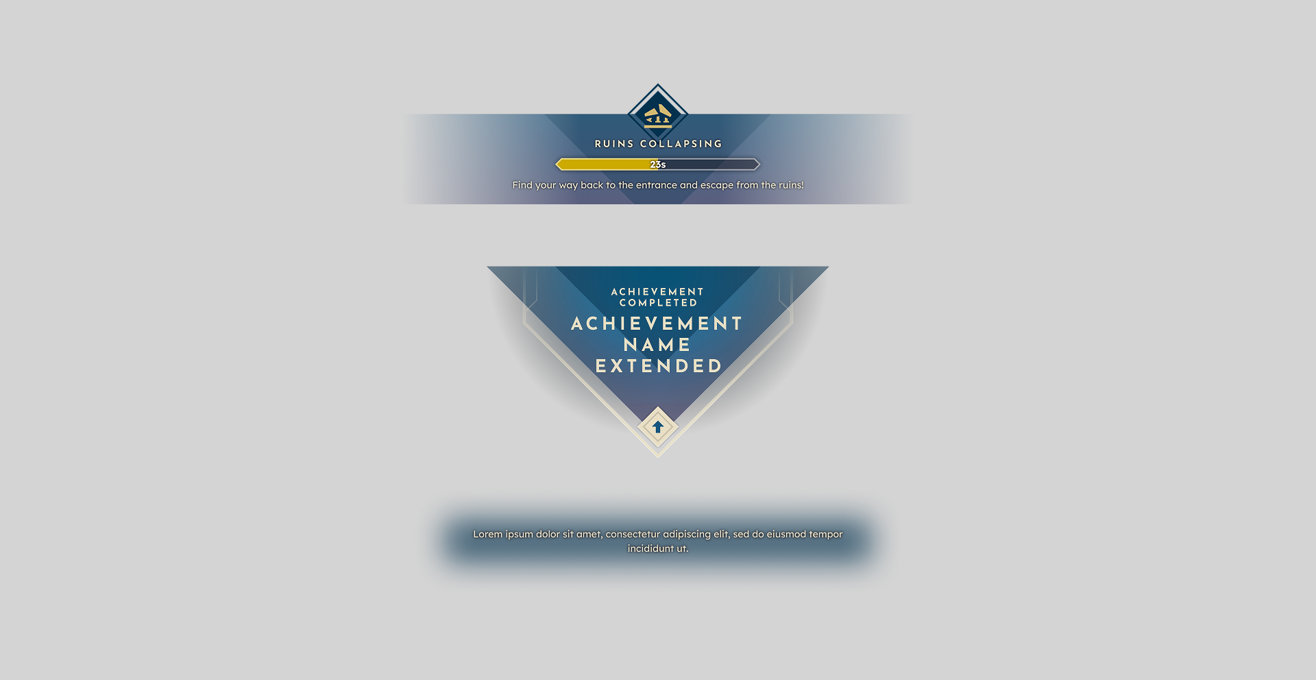
Interface Design
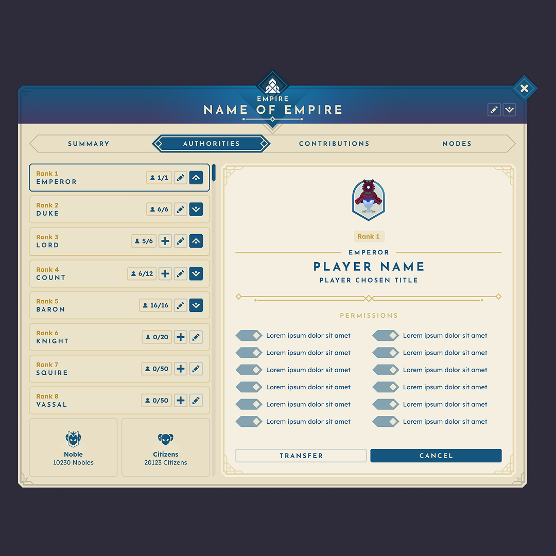
The component library extended that system across the full MMO surface area without relying on one-off patterns.

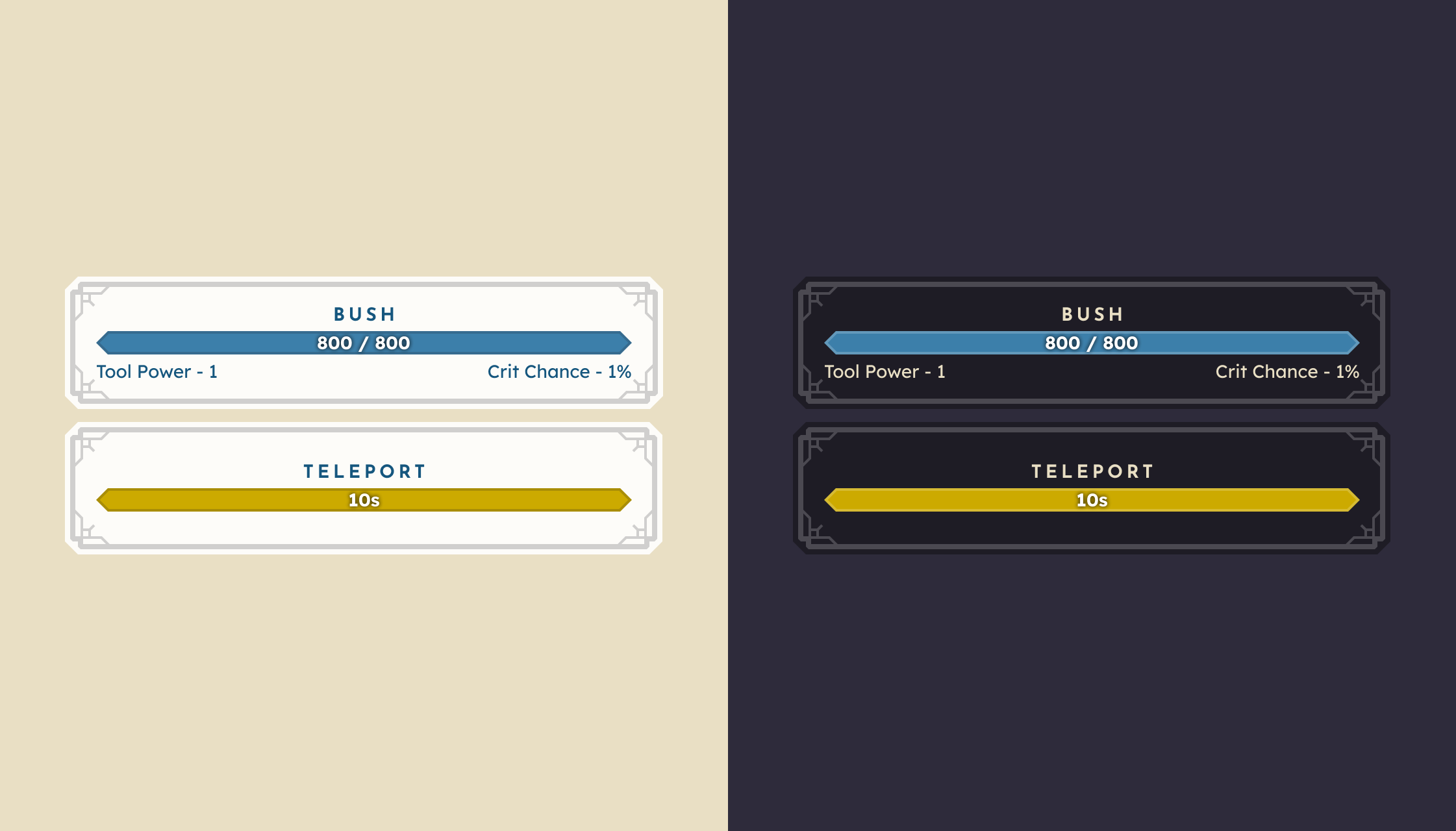
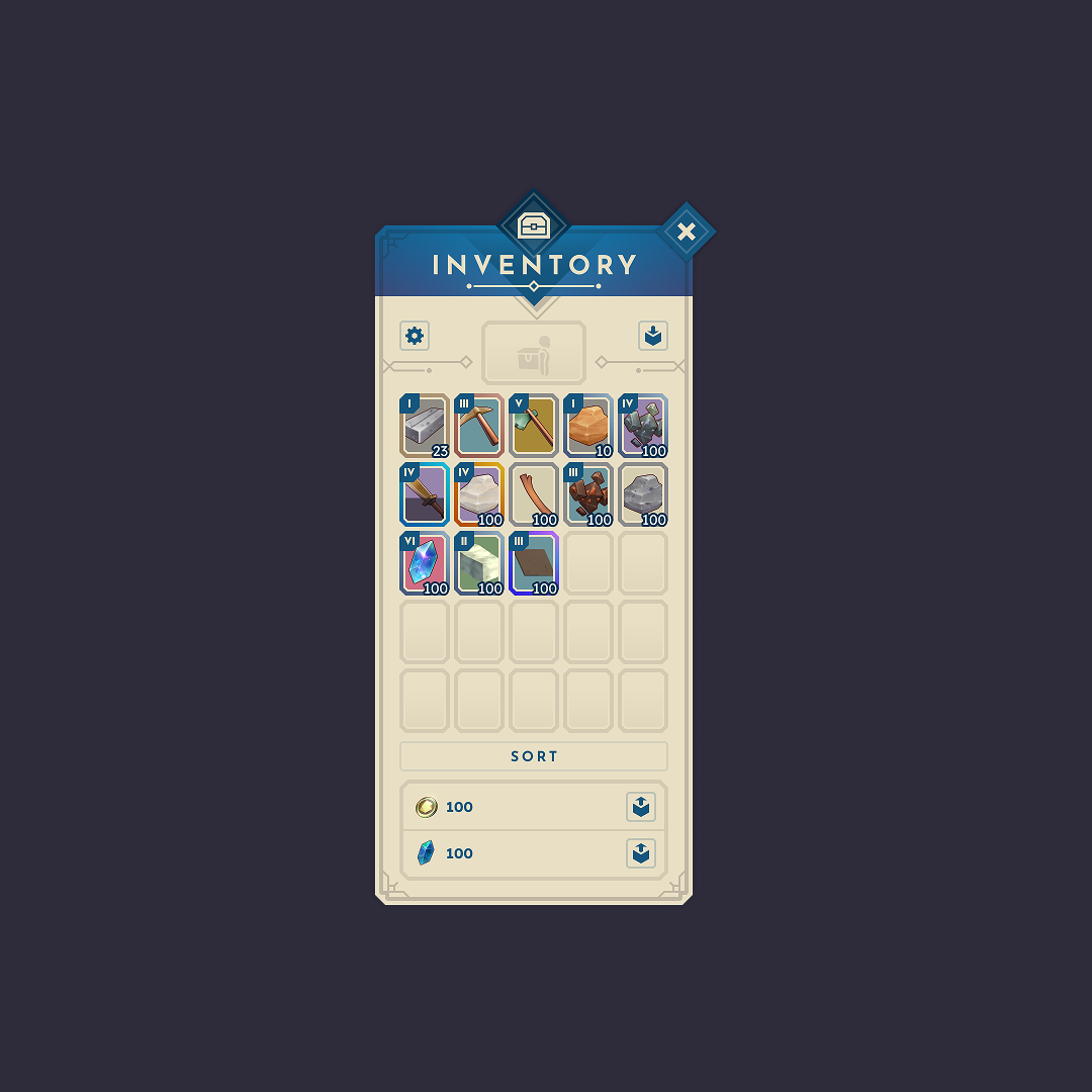
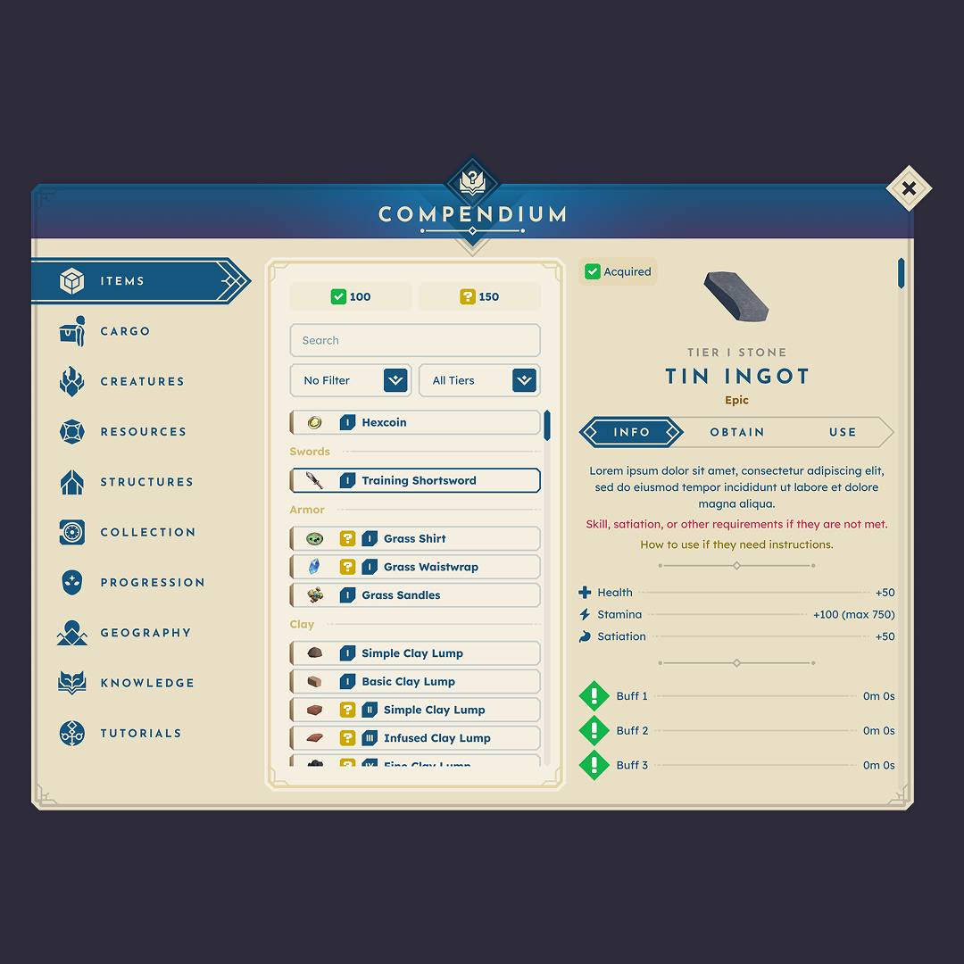
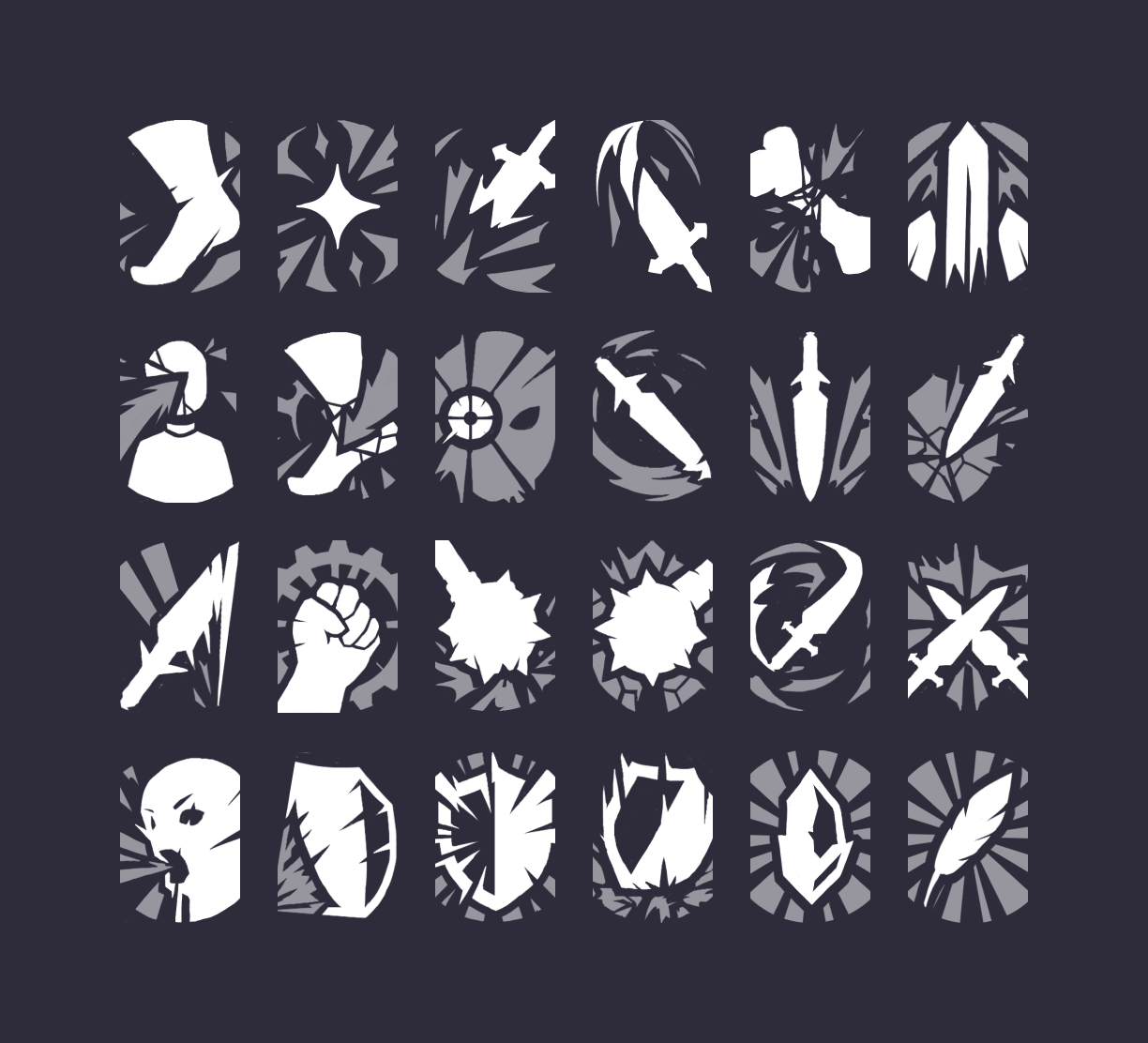
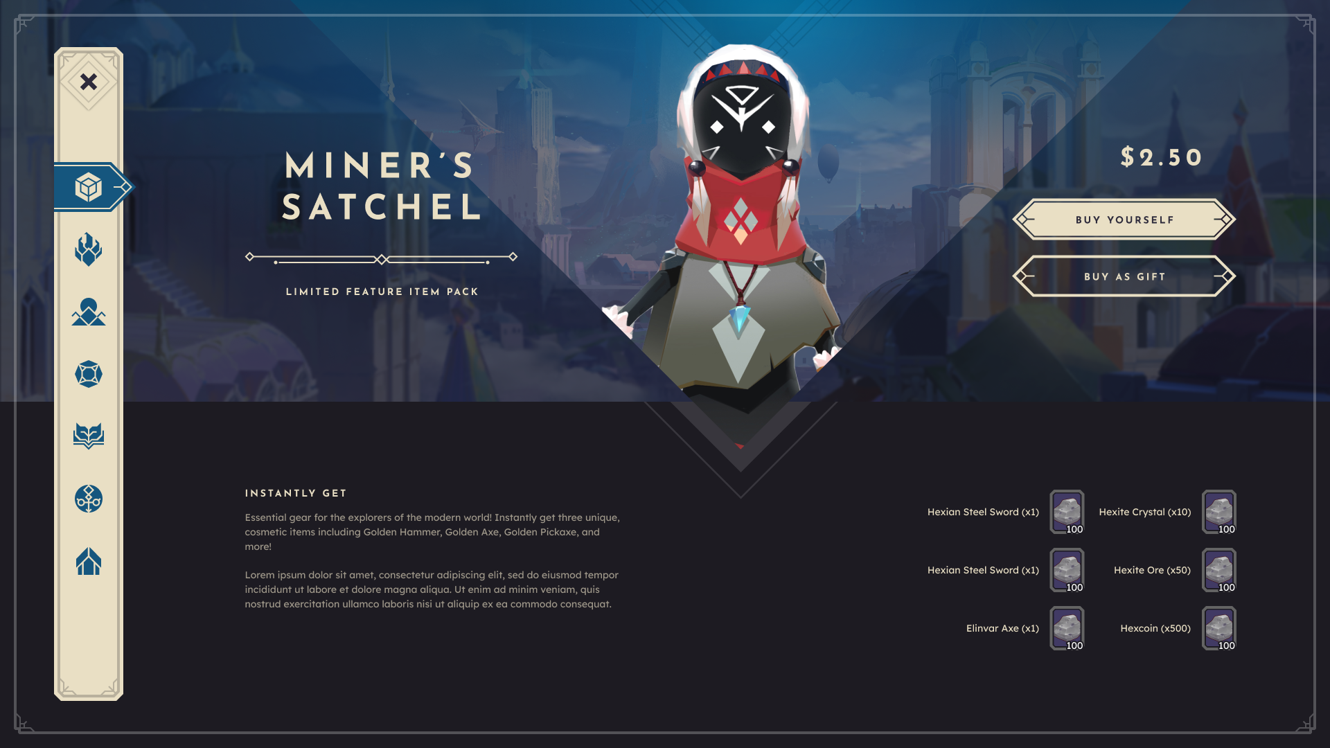
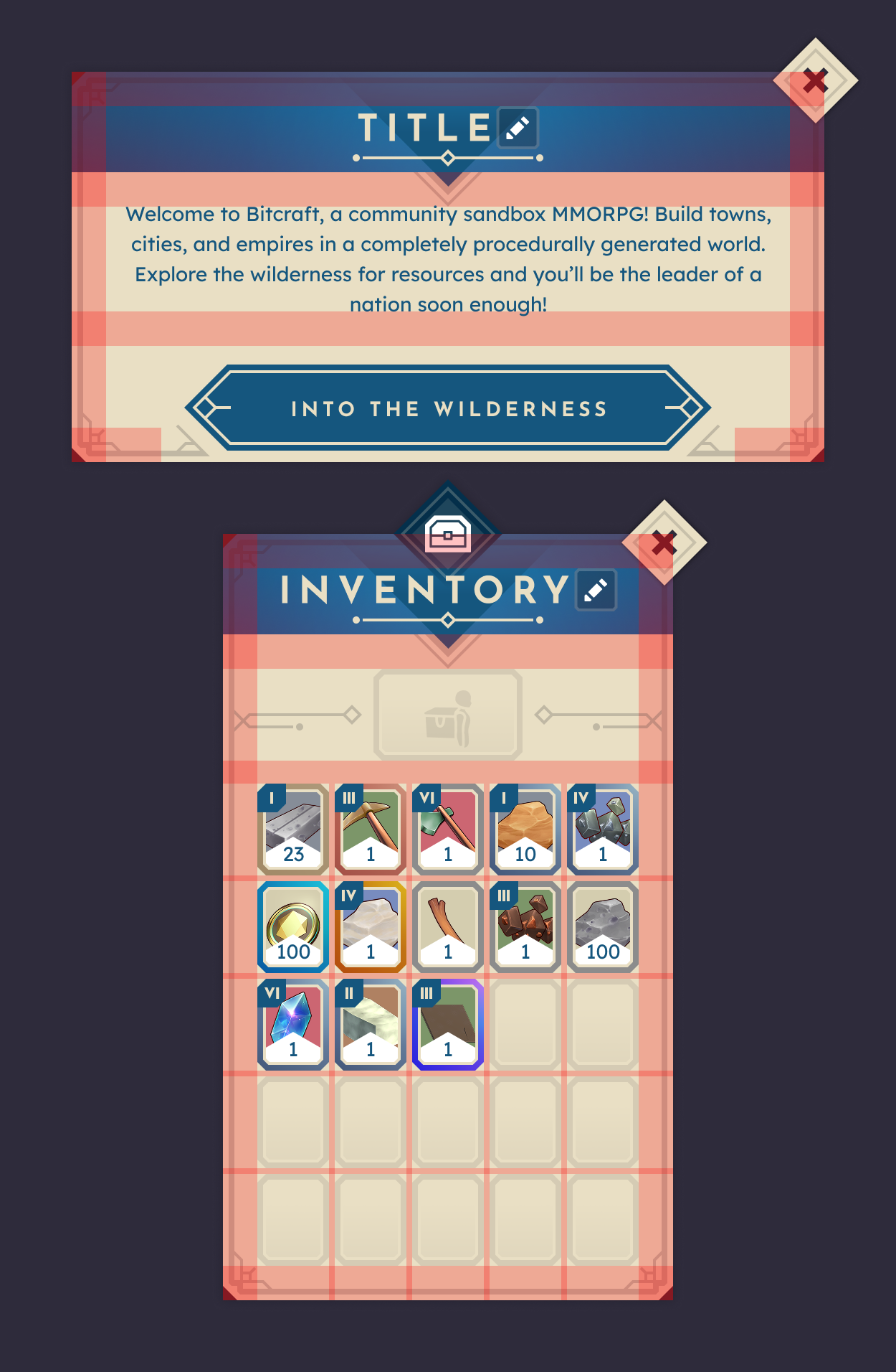
Modeling Complex Game Entities
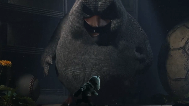
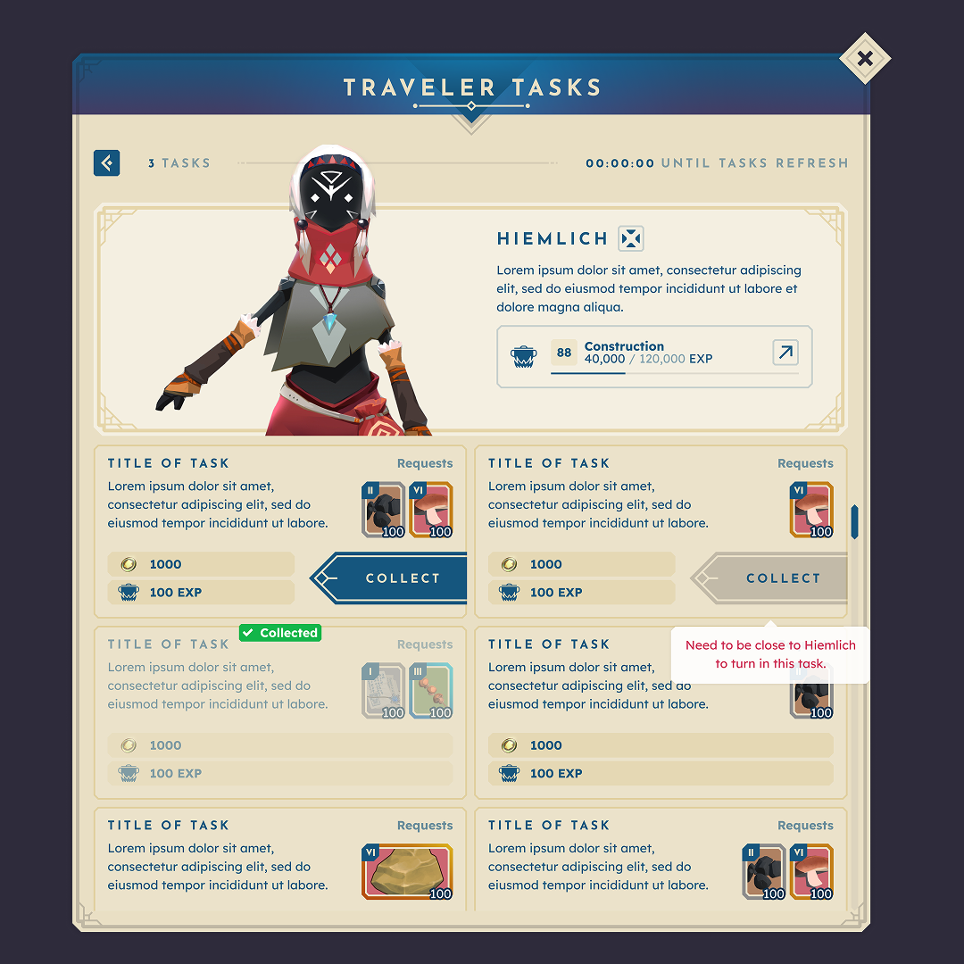
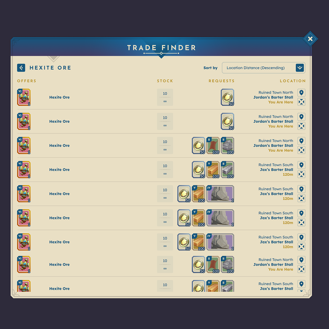
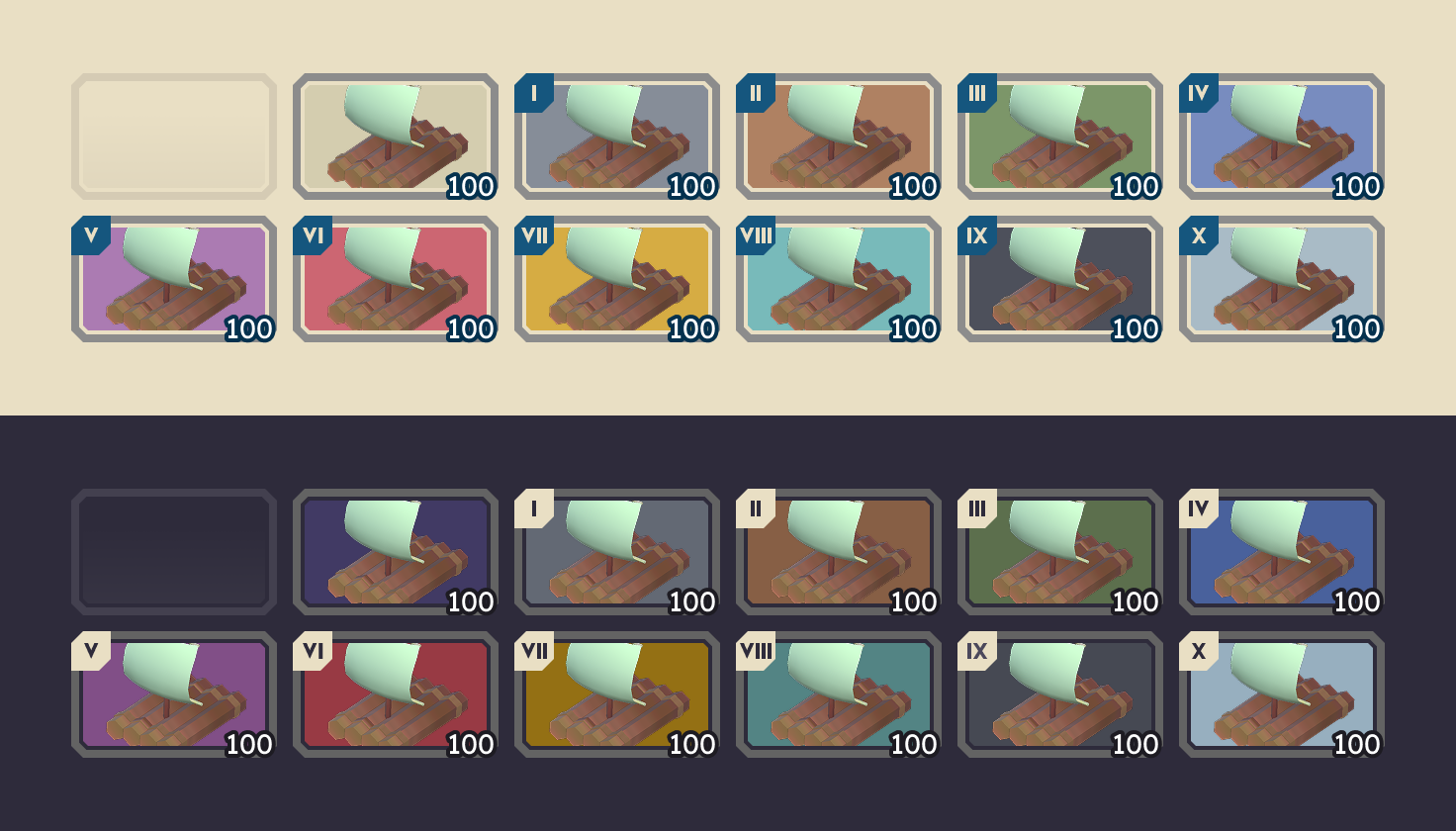
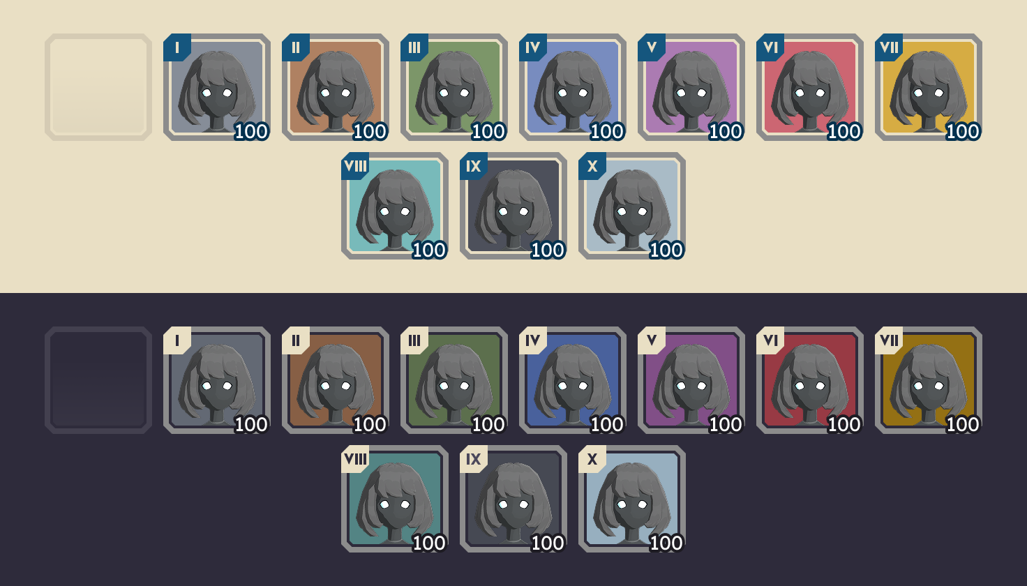
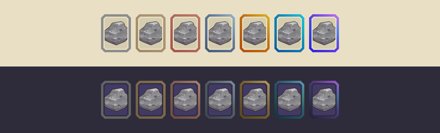
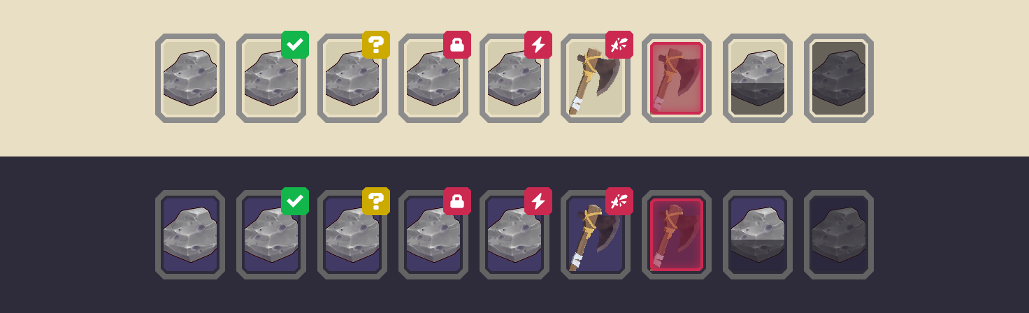
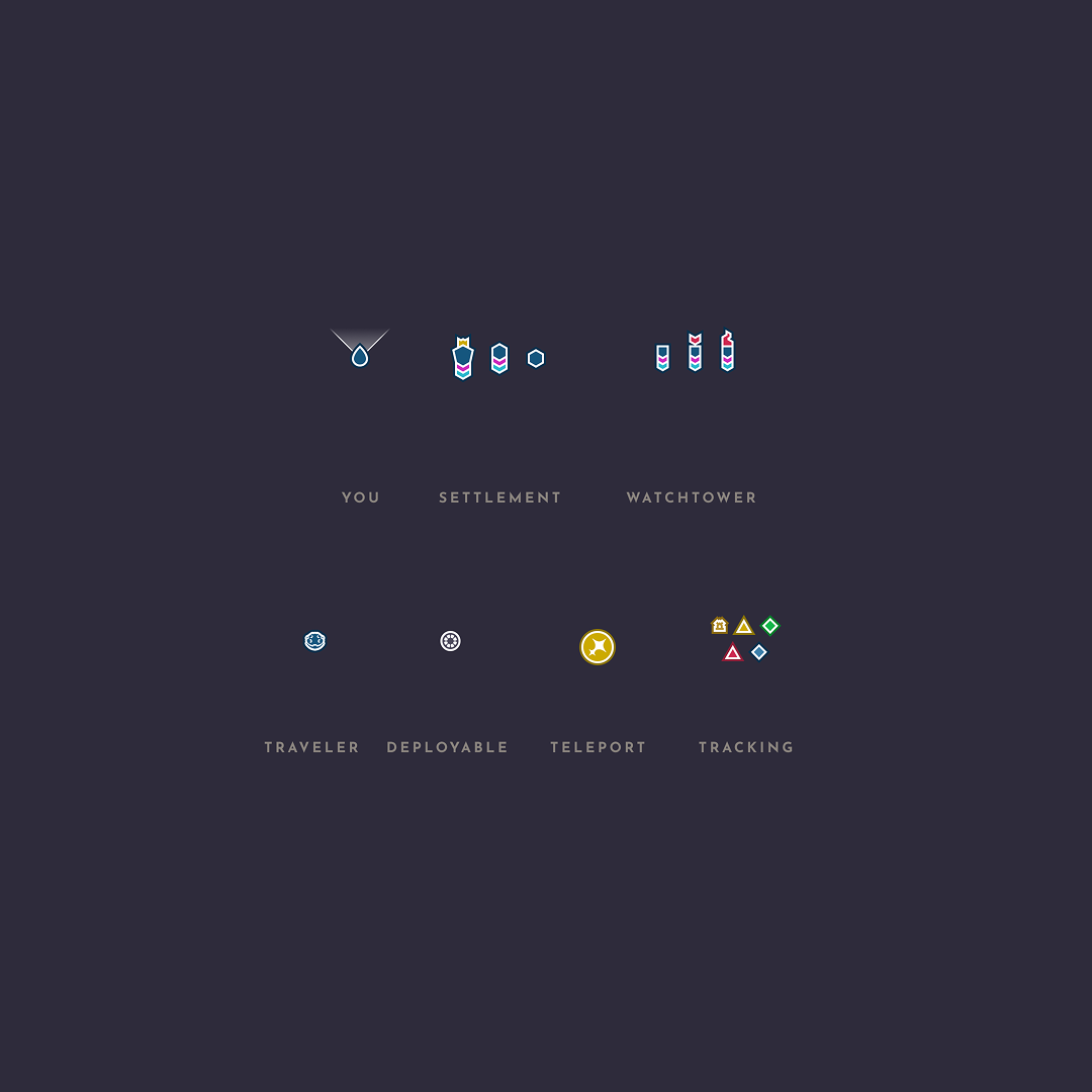
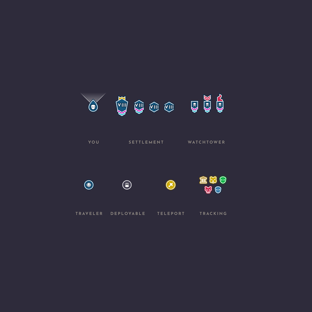
Items, cargo, and collectables each operate under different rules. Their structure and presentation were designed so players could distinguish them at a glance.
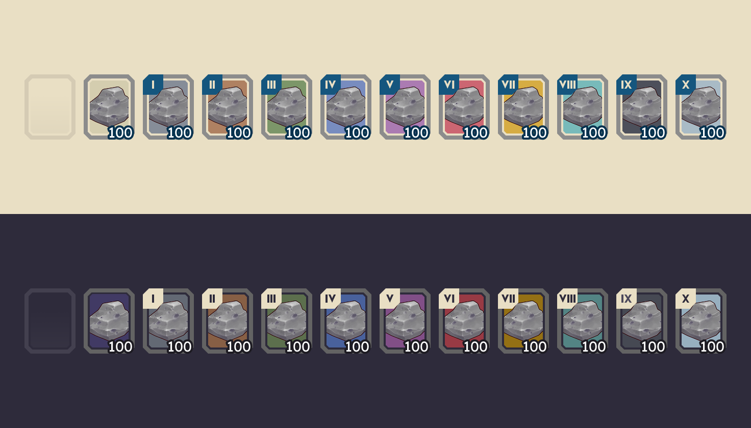
Designing for Long Play Sessions
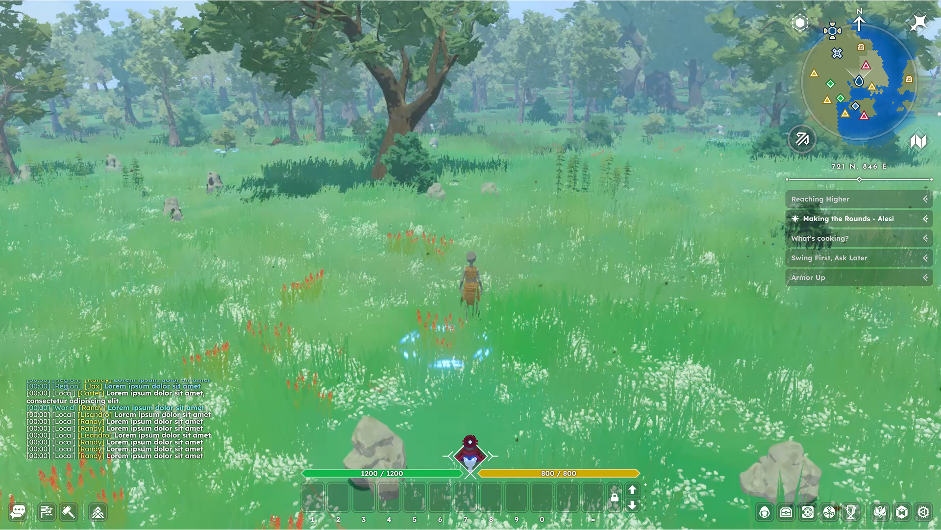
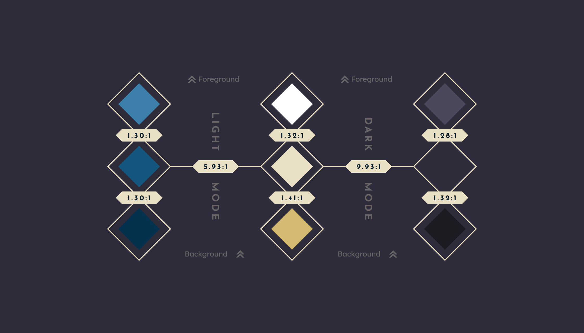
MMO sessions are long by nature. The UI was paired with the game's day-night cycle so light and dark modes could reduce visual fatigue without compromising readability.
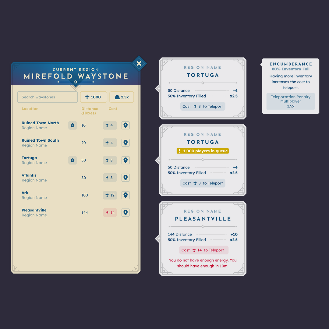
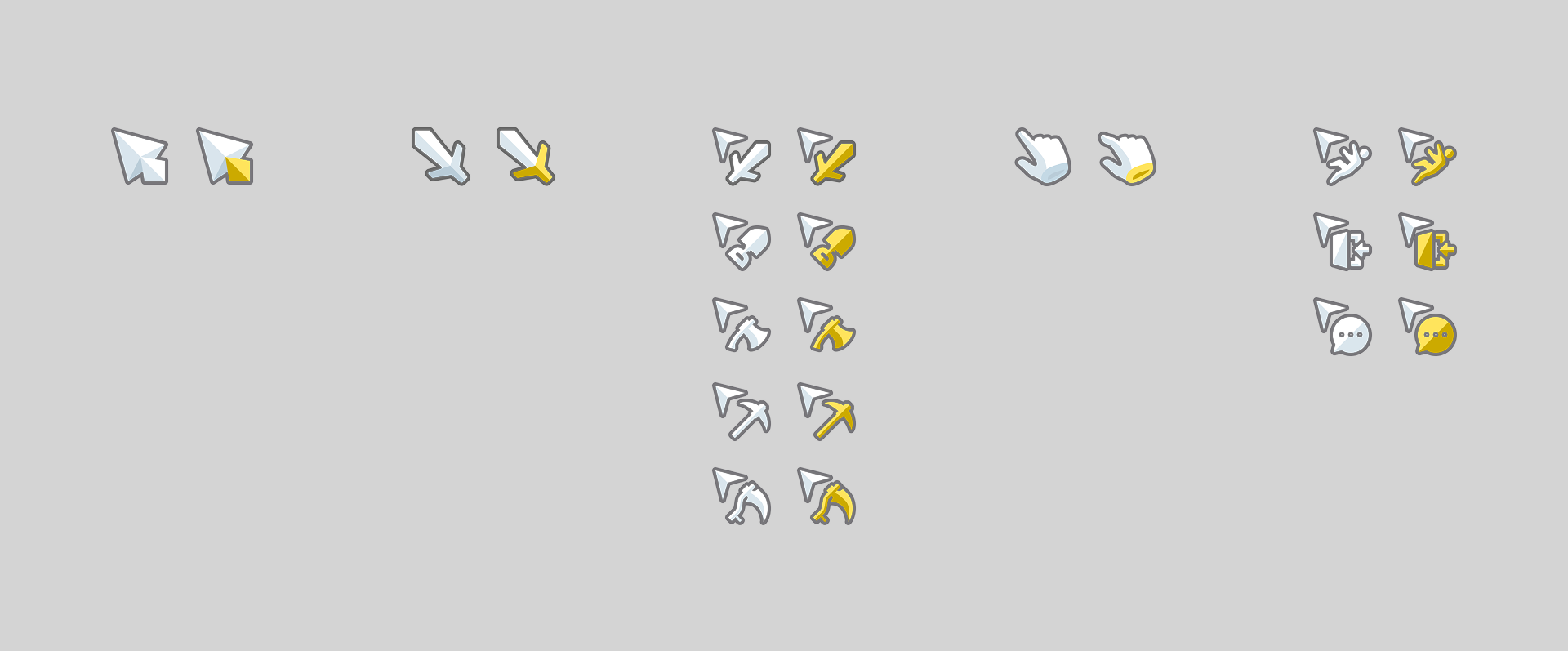
Designing the In-Game Map
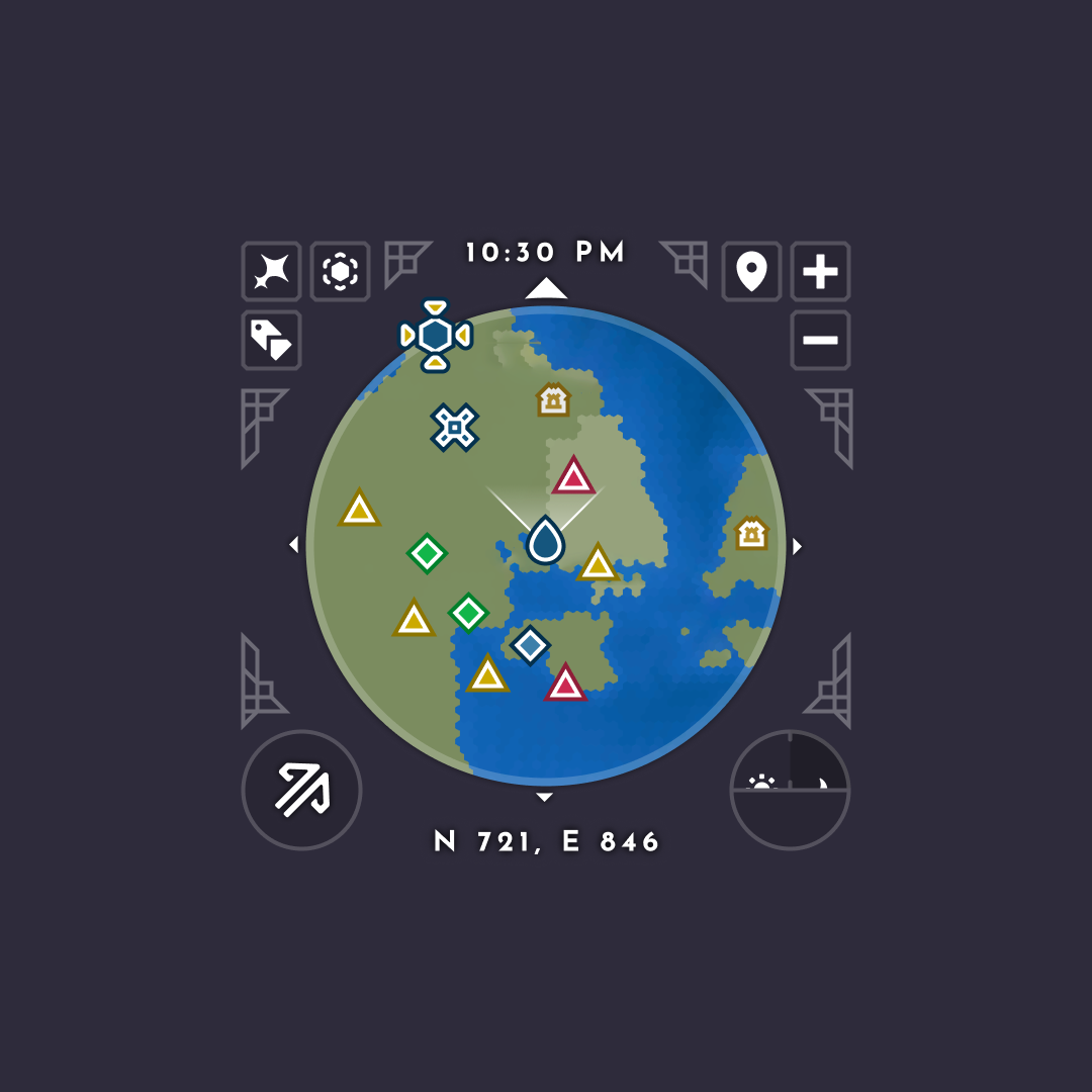
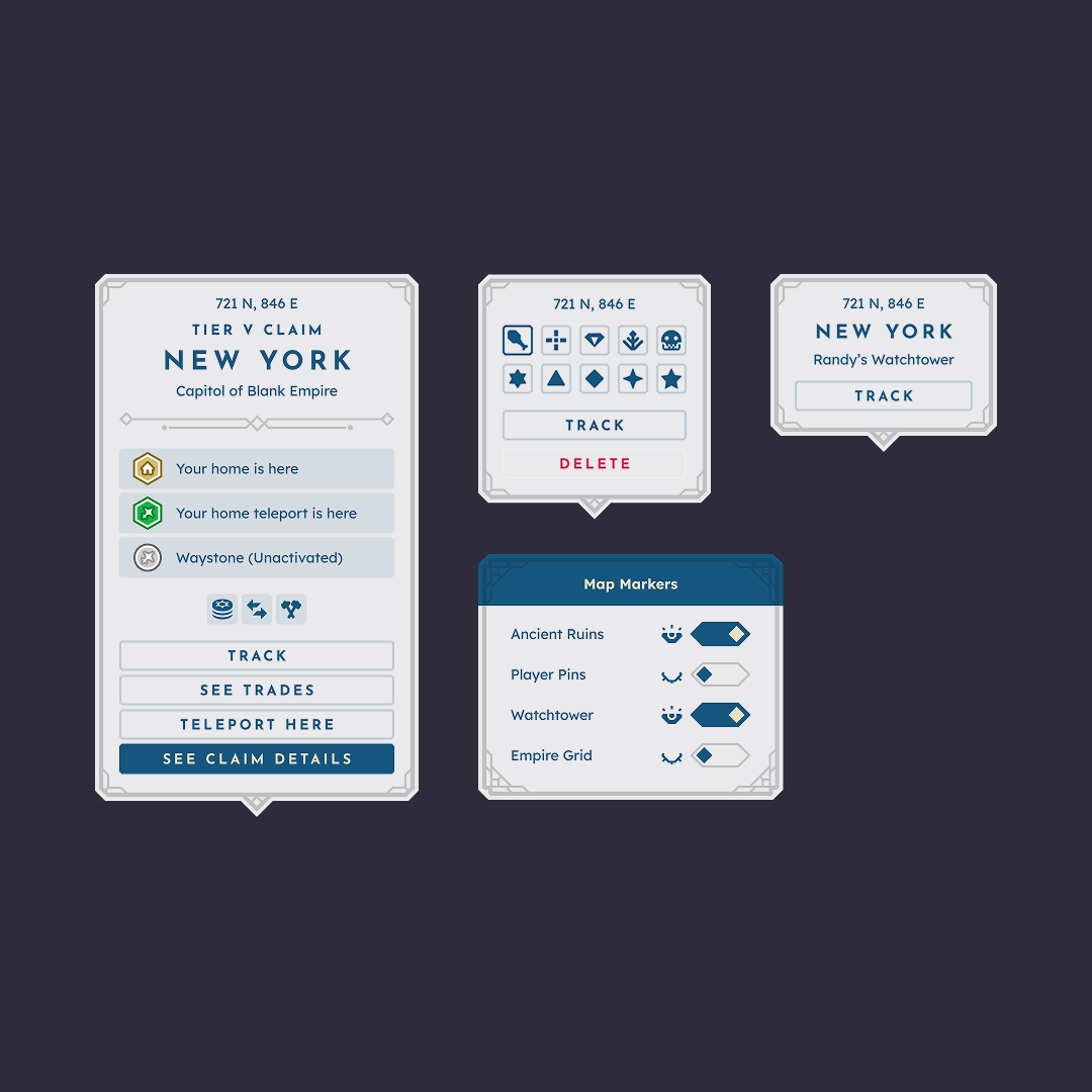
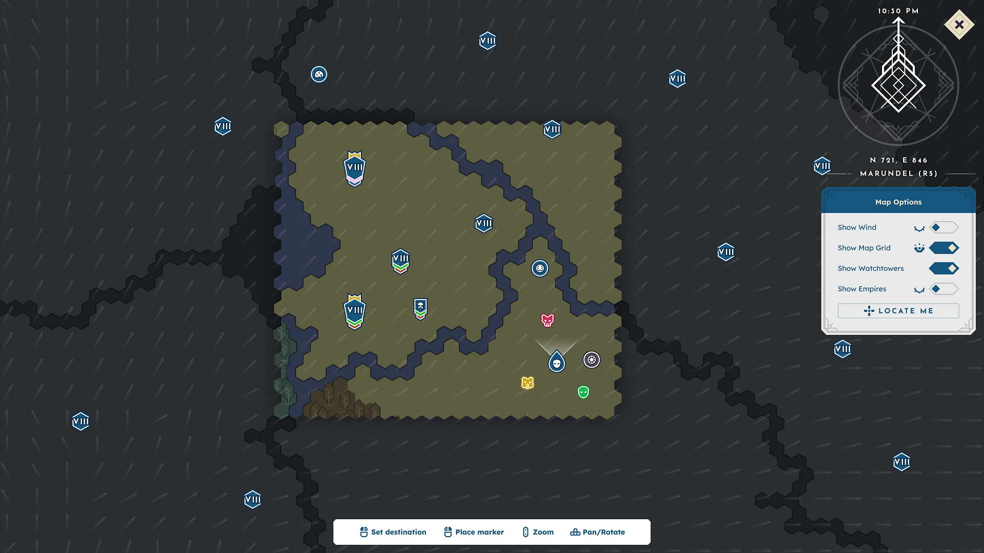
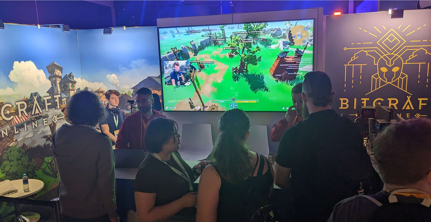
The map needed to communicate complex world-state information clearly across multiple zoom levels and in the minimap. I designed an icon system for players, creatures, ruins, claims, empires, and custom markers, while ensuring the map could support interactions such as claim previews, marker placement, and tracking. Biomes, borders, and sailing wind direction also needed to remain immediately readable.
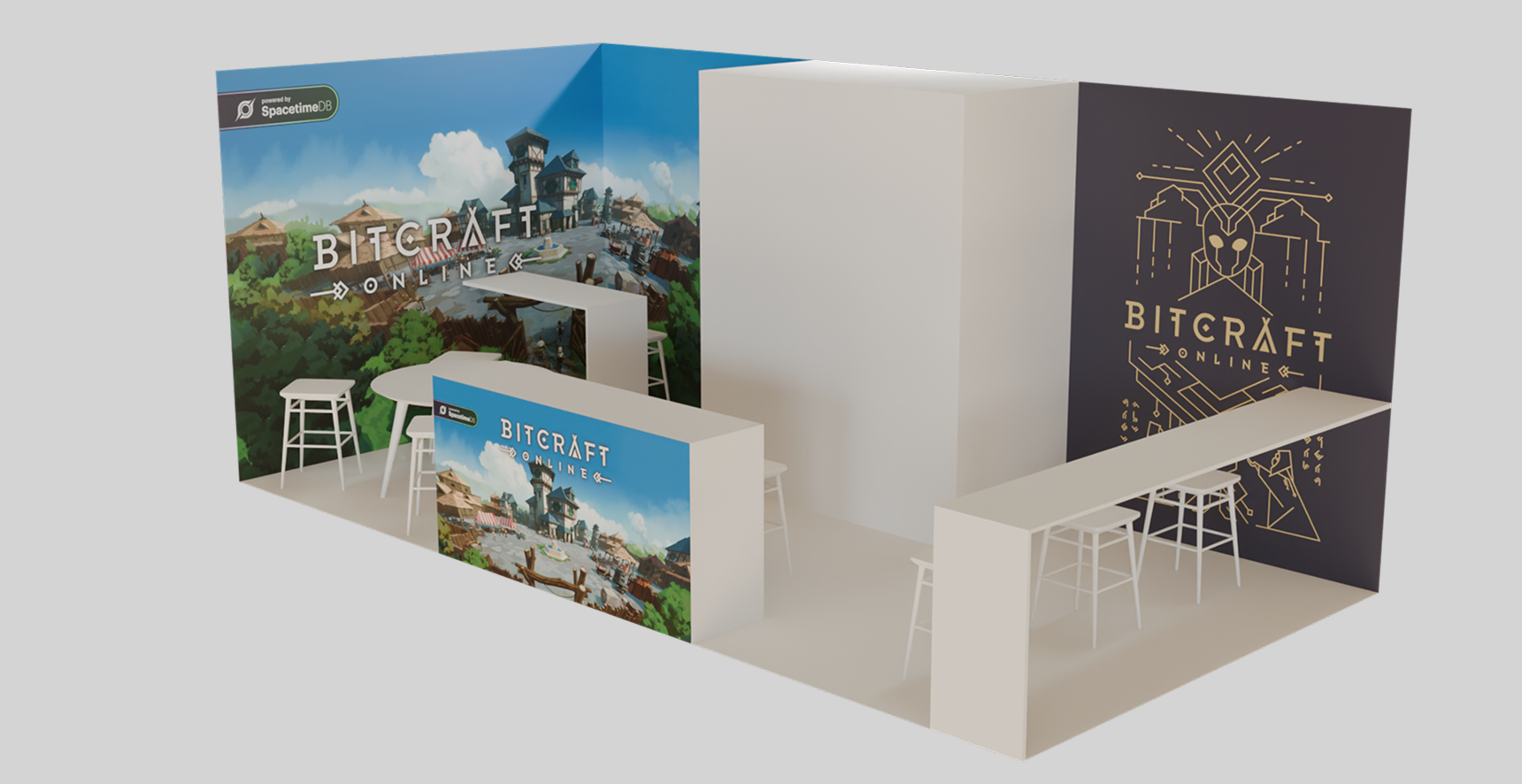
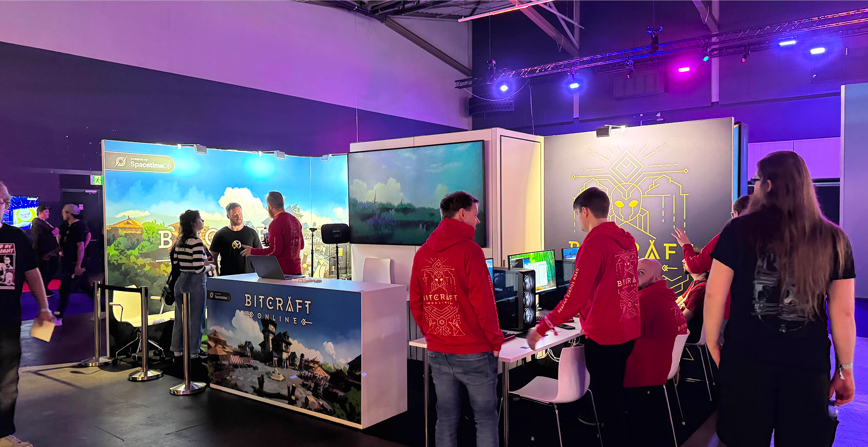
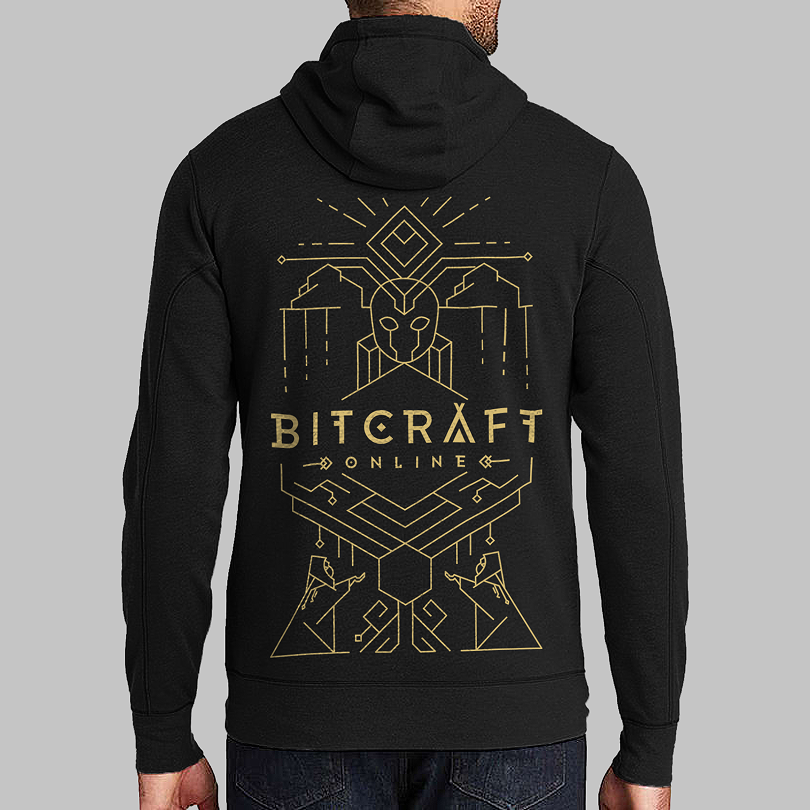
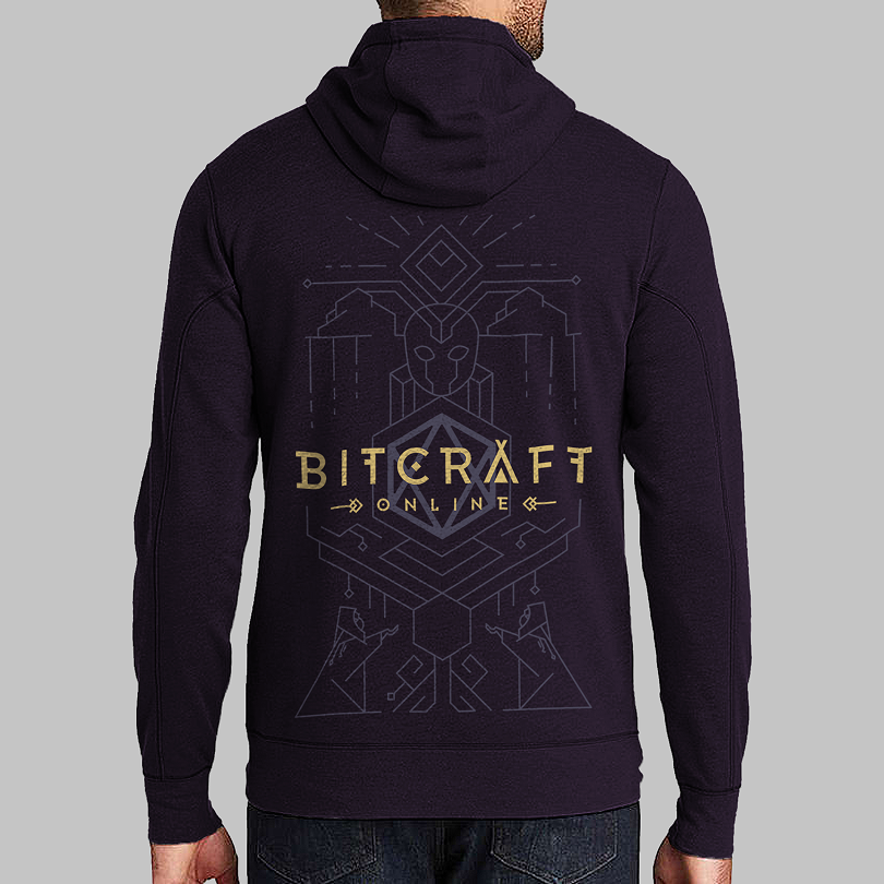
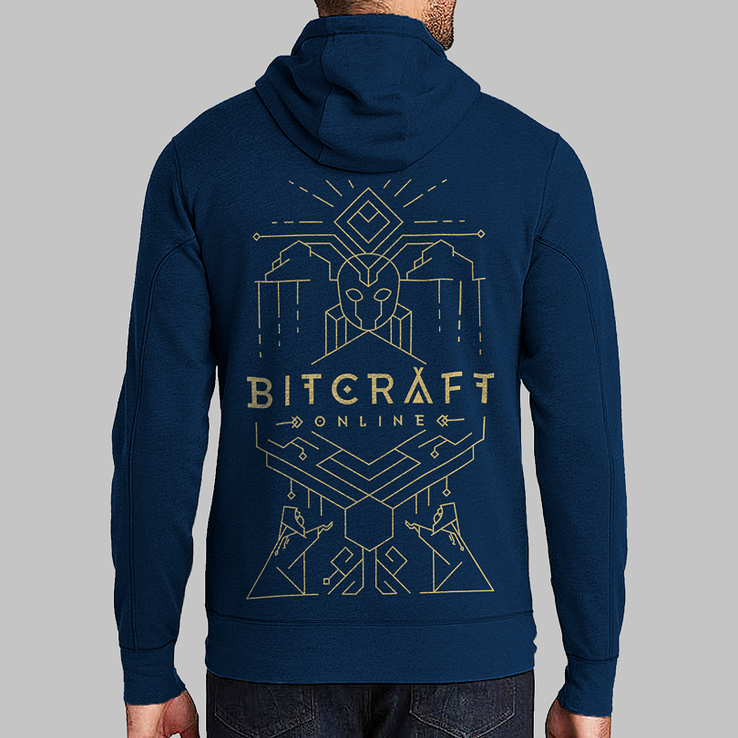
Marketing & Brand
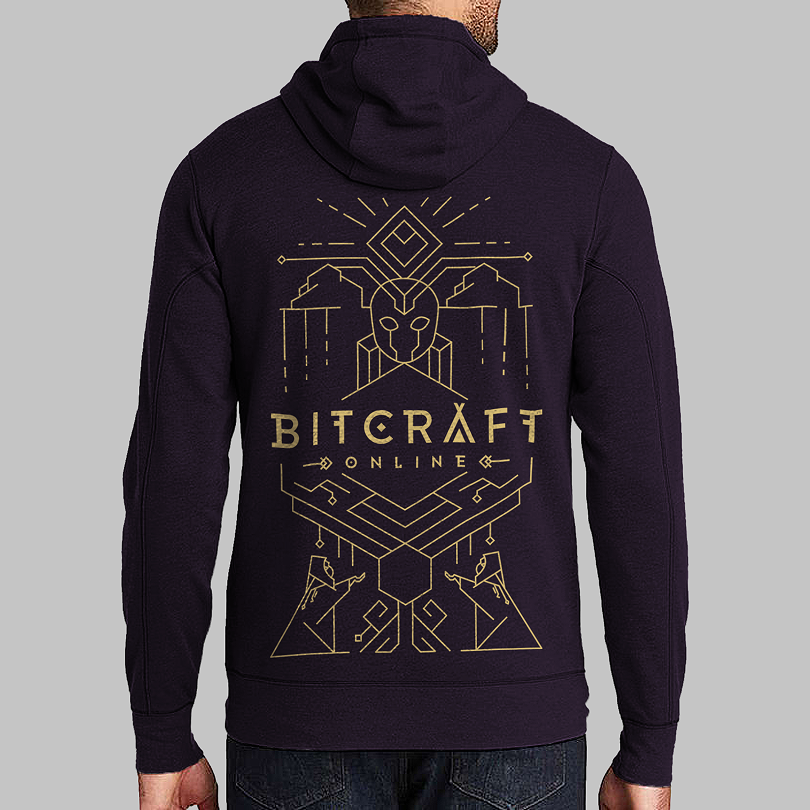
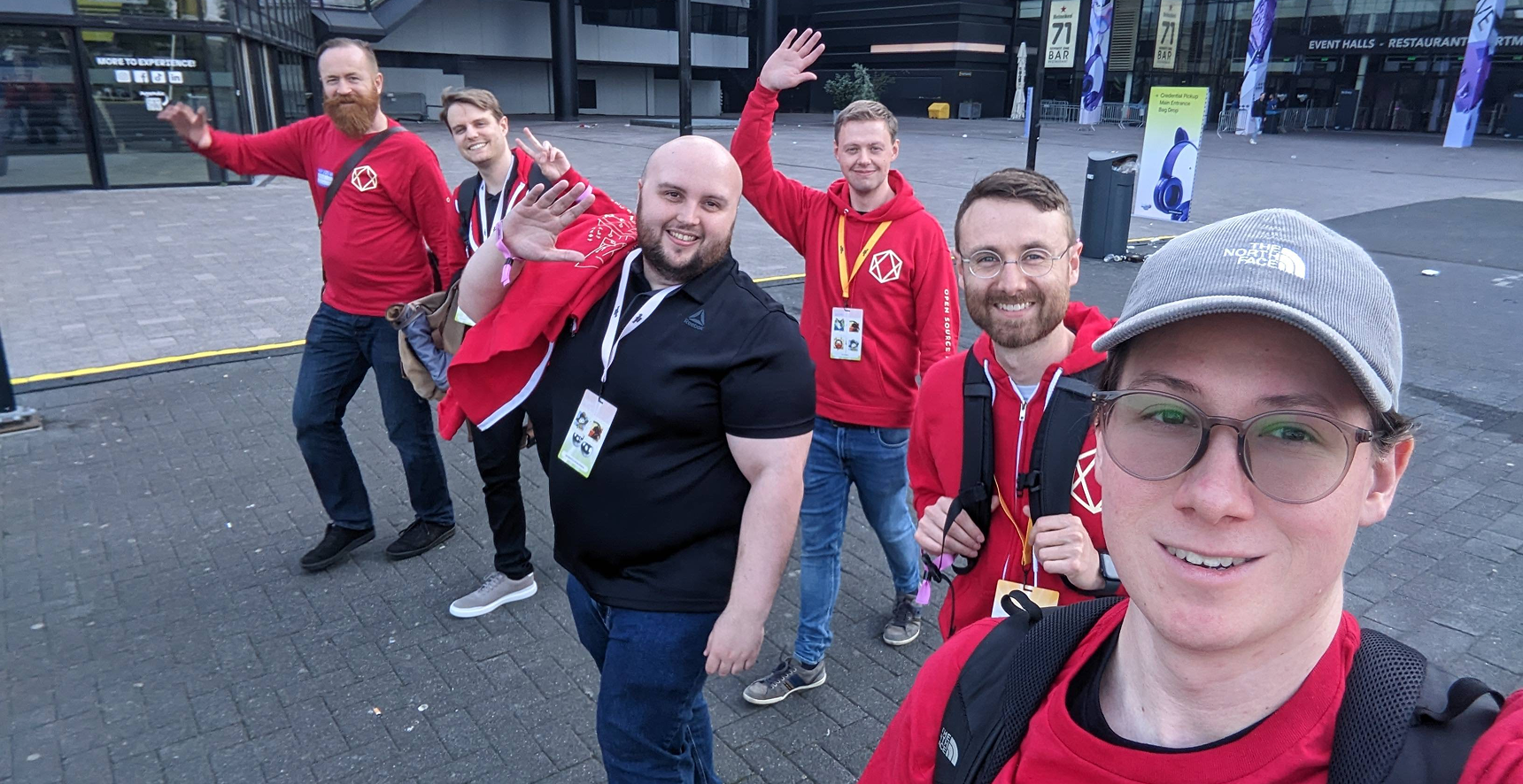
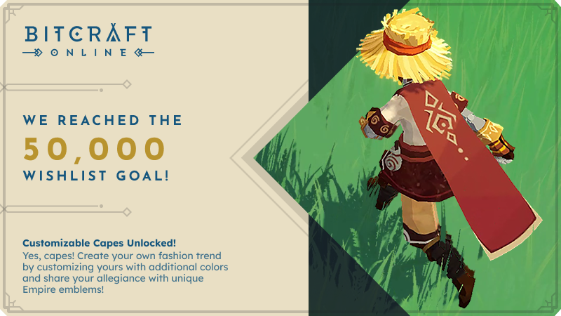
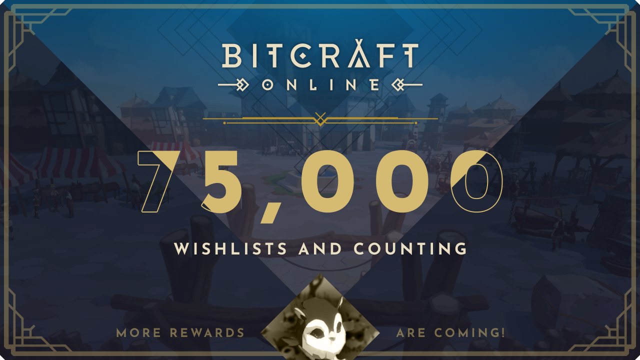
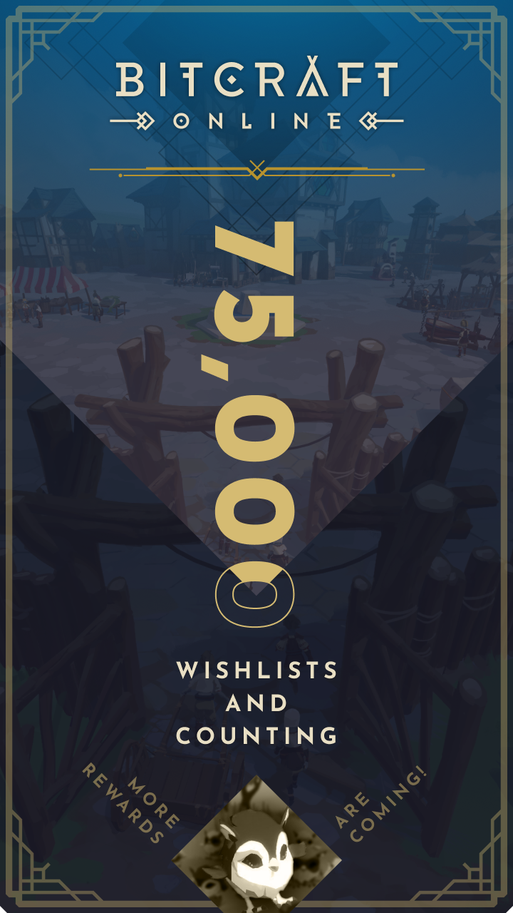
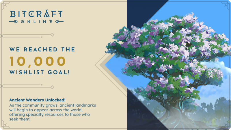
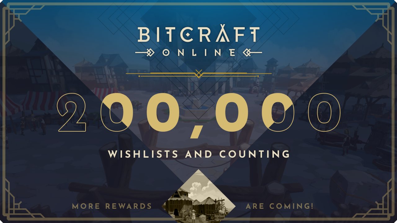
The design language was extended into booth design, merchandise, and Steam campaign assets.
Outcome
The game entered early access with strong traction across wishlists, concurrent players, and sales.