Current role

SpacetimeDB at Clockwork Labs

As the sole designer, I led the design of SpacetimeDB's developer portal and formalized the visual system behind it.

Built on an existing brand foundation to create a cohesive developer product experience, while strengthening the underlying typography, spacing, and color system.

Client
Clockwork Labs

Skills
UI/UX Design
Branding
Motion Design
3D

Tools
Figma
Blender
After Effects

My Role
Product Designer

Timeline
Q3 2024 – Present

Team
Tyler Cloutier (Co-Founder & CEO)
Alessandro Asoni (Co-Founder & CTO)

Challenge

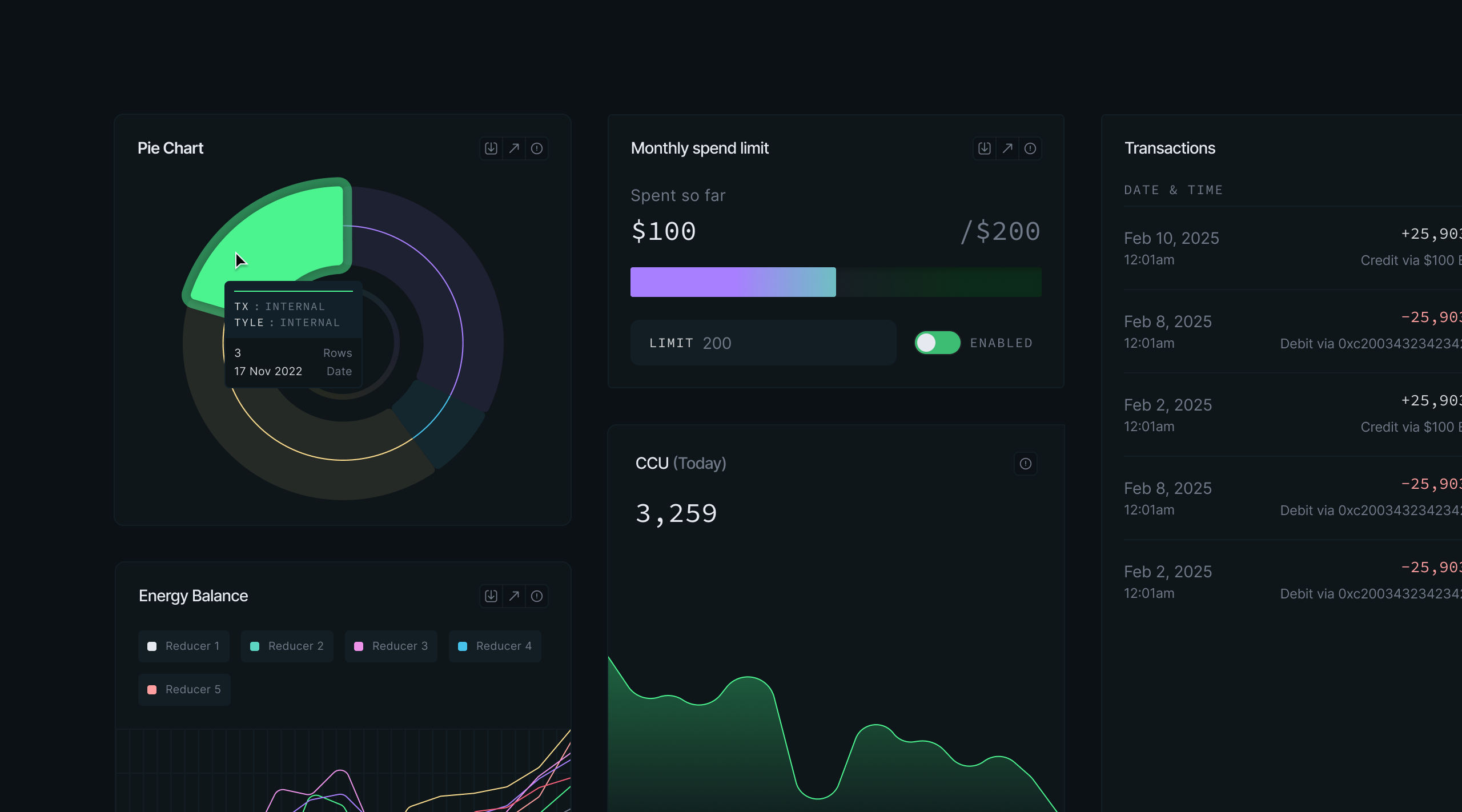
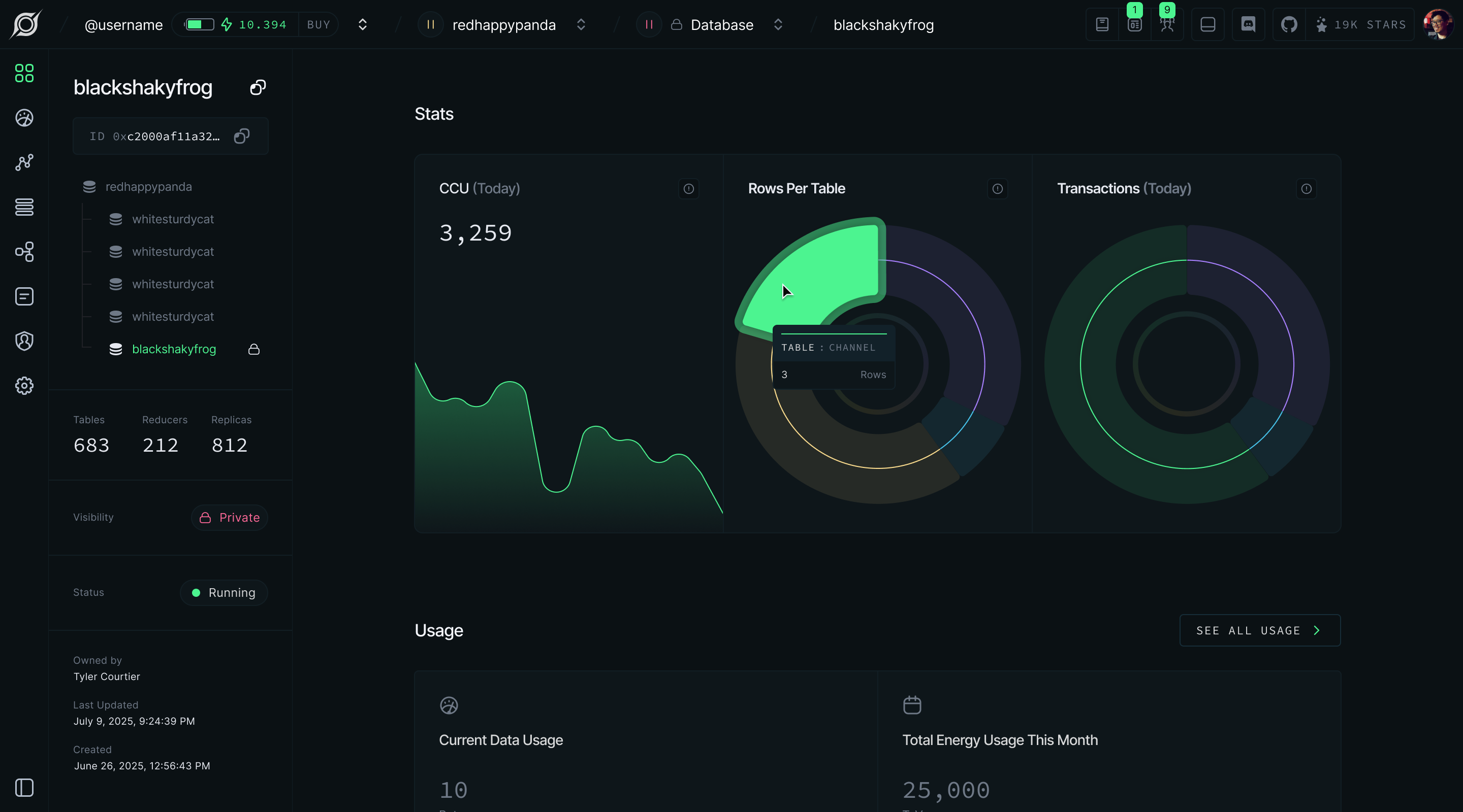
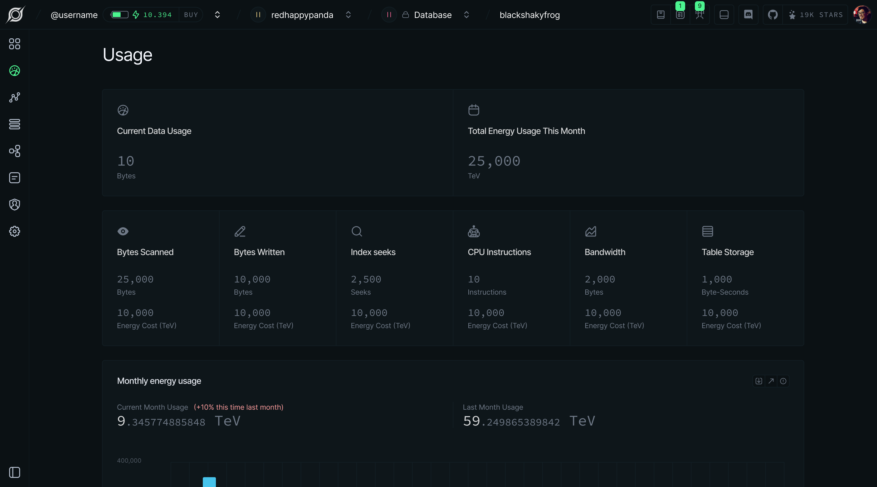
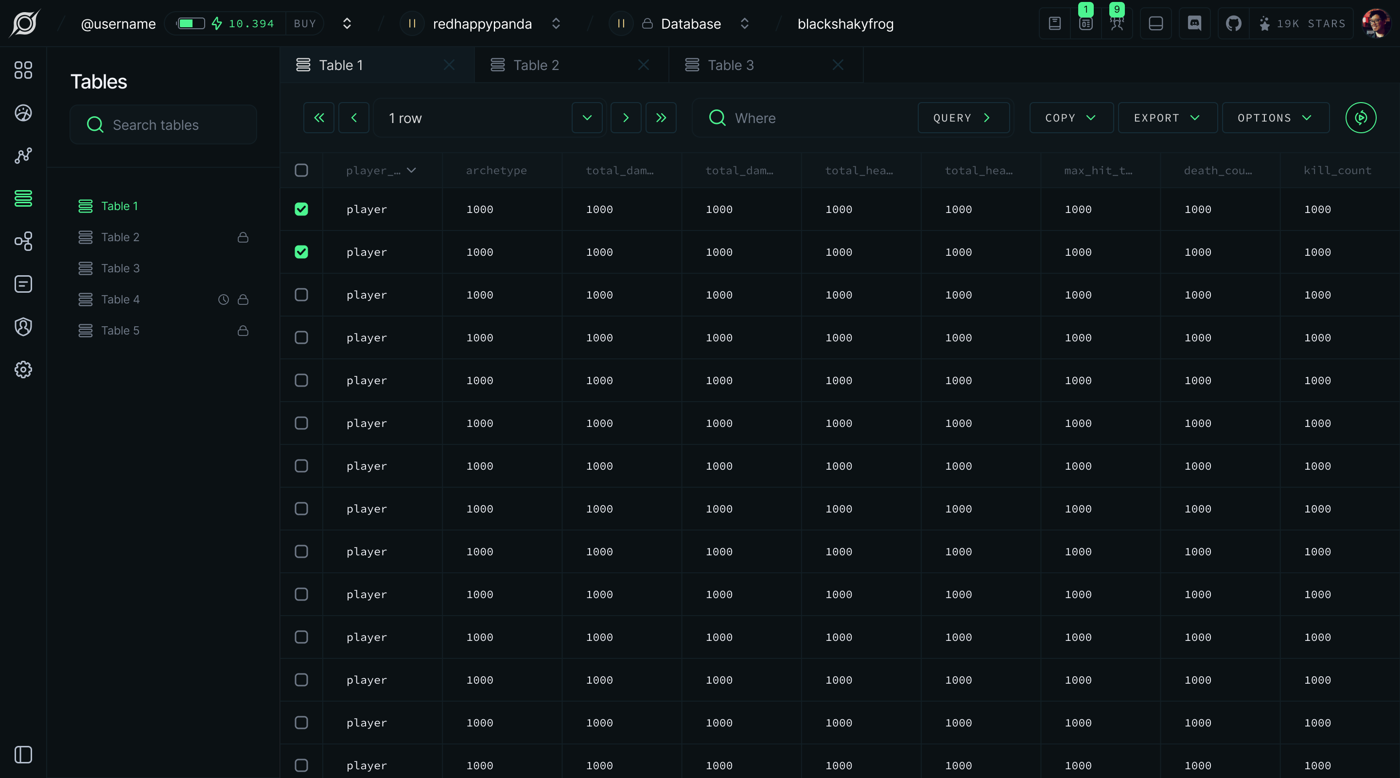
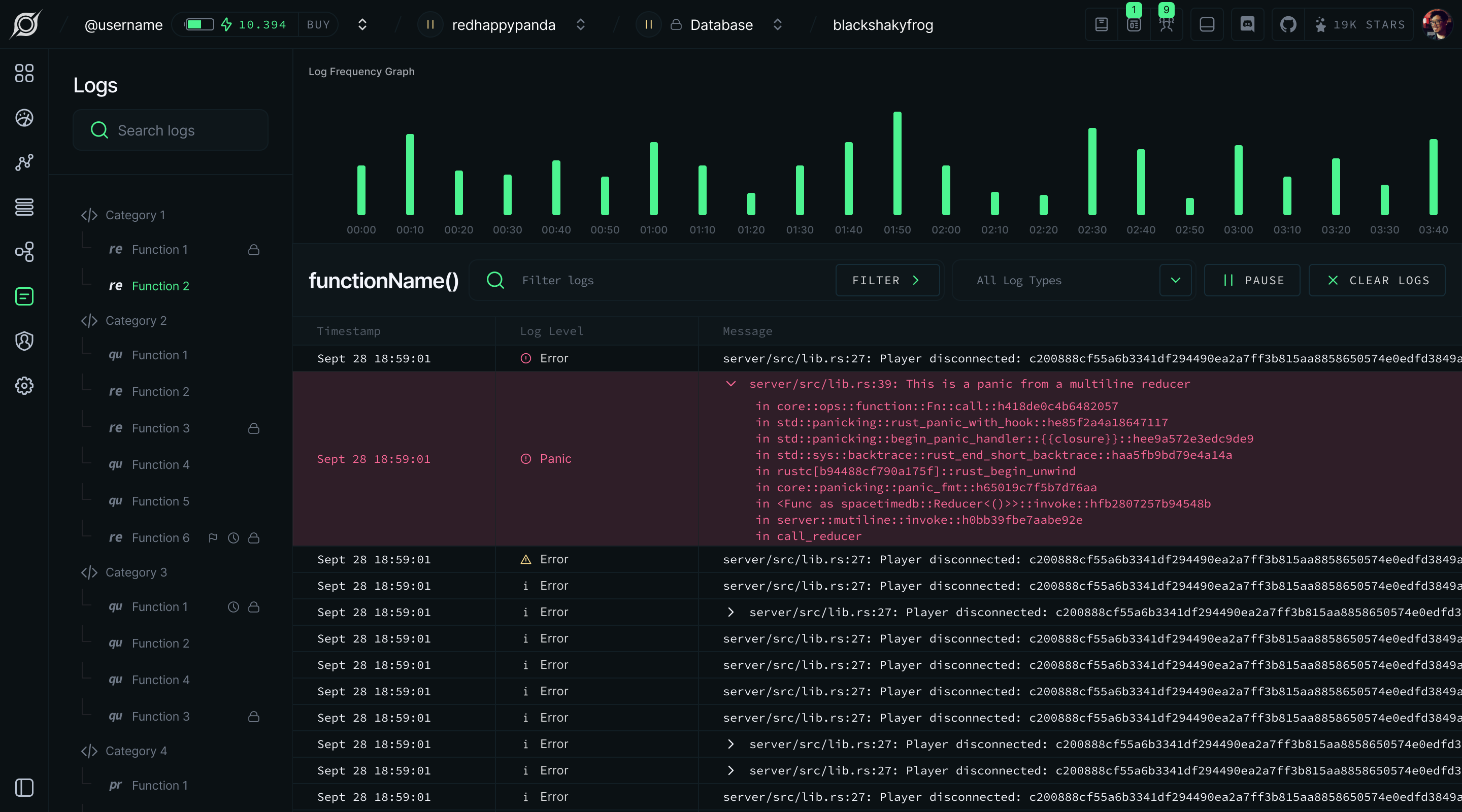
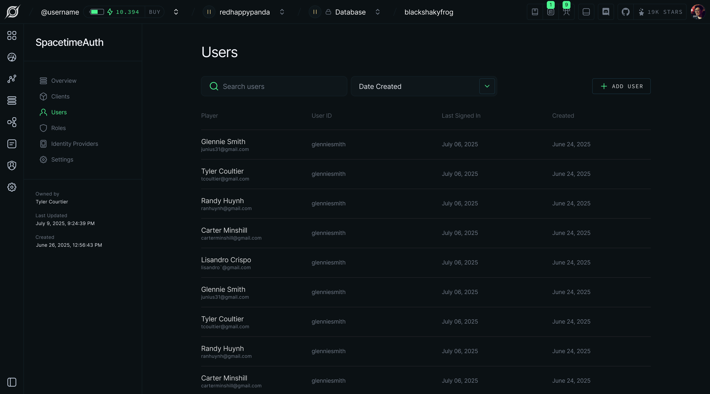
SpacetimeDB needed a developer portal designed from the ground up, capable of supporting database creation, usage monitoring, metrics, table and function inspection, logs, and organization management. Each screen is information-dense and intended for technical users who need to move quickly and trust what they are seeing. The brand foundation existed, but it had not yet been formalized into a system robust enough to support a product of this complexity.


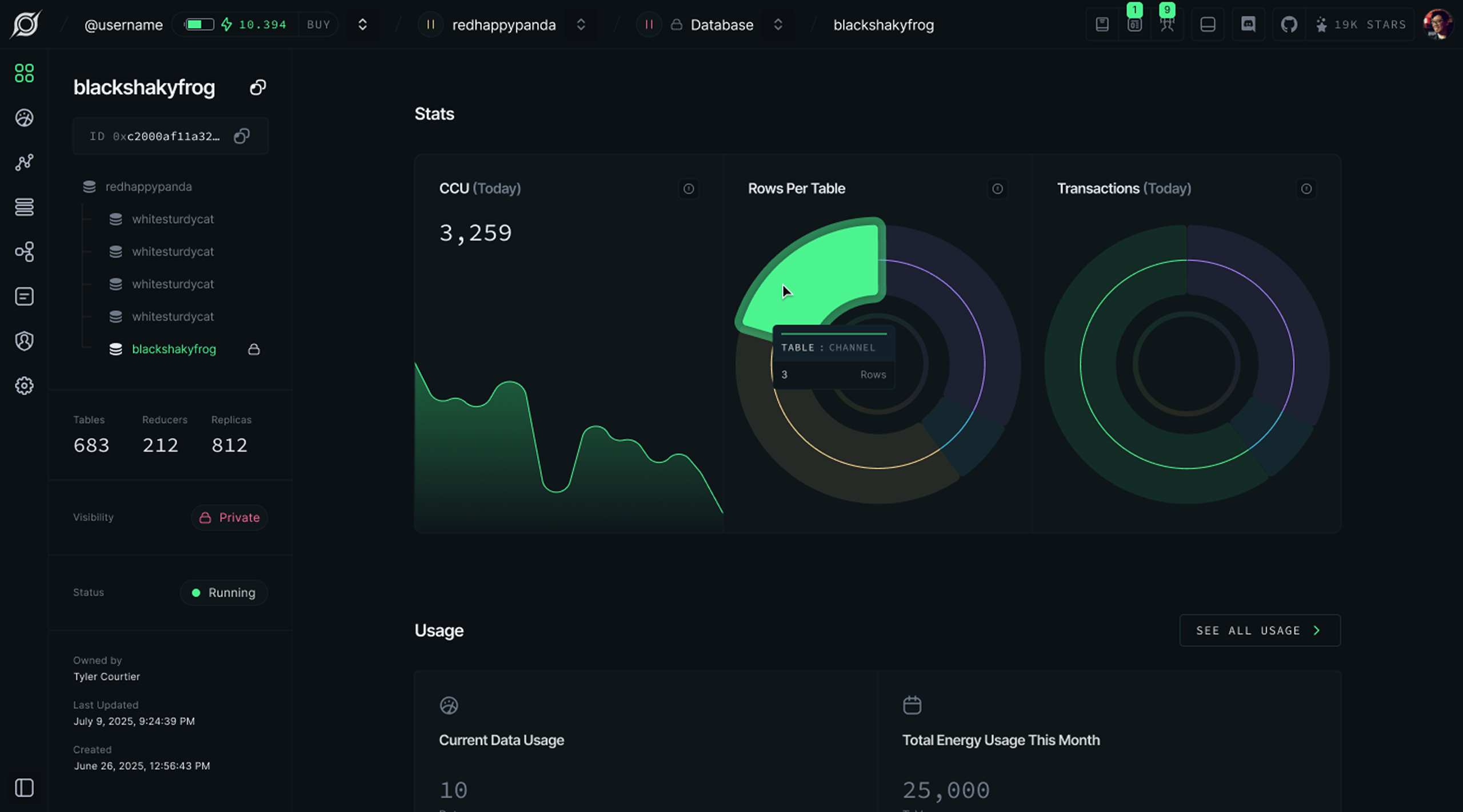
Designing the Portal

I designed each key screen around its specific job, rather than forcing a single template across fundamentally different types of content.


Project Listing & Account Settings
The first screen after login, providing a project overview with quick-access controls and account management.

Project Dashboard: Overview
A high-level view of database health and recent activity, without requiring users to drill into details.

Project Dashboard: Metrics
Performance telemetry over time, presented clearly without forcing users to parse raw data.

Project Dashboard: Tables & Functions
The core daily workflow for browsing data structures, inspecting records, and reviewing server-side logic.

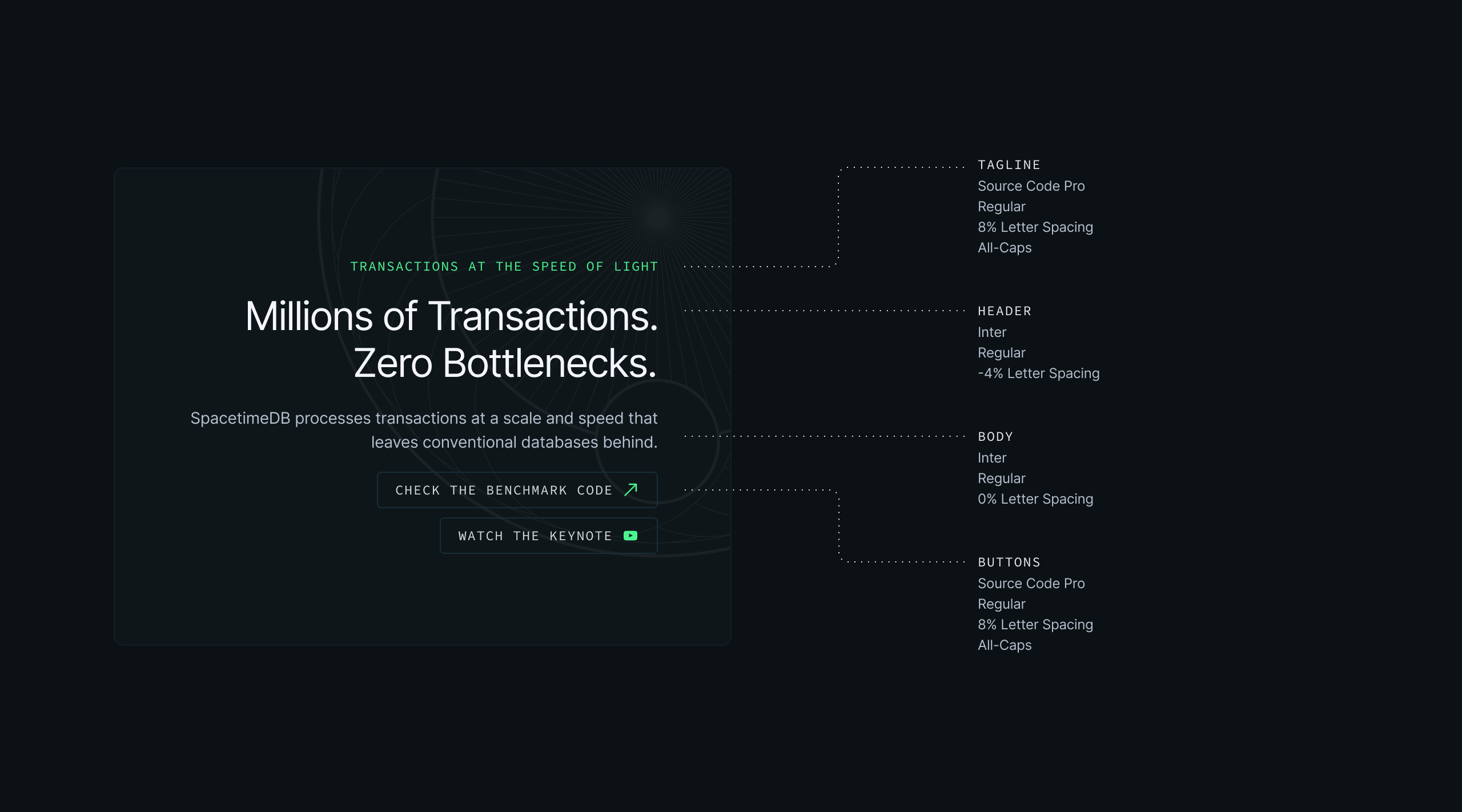
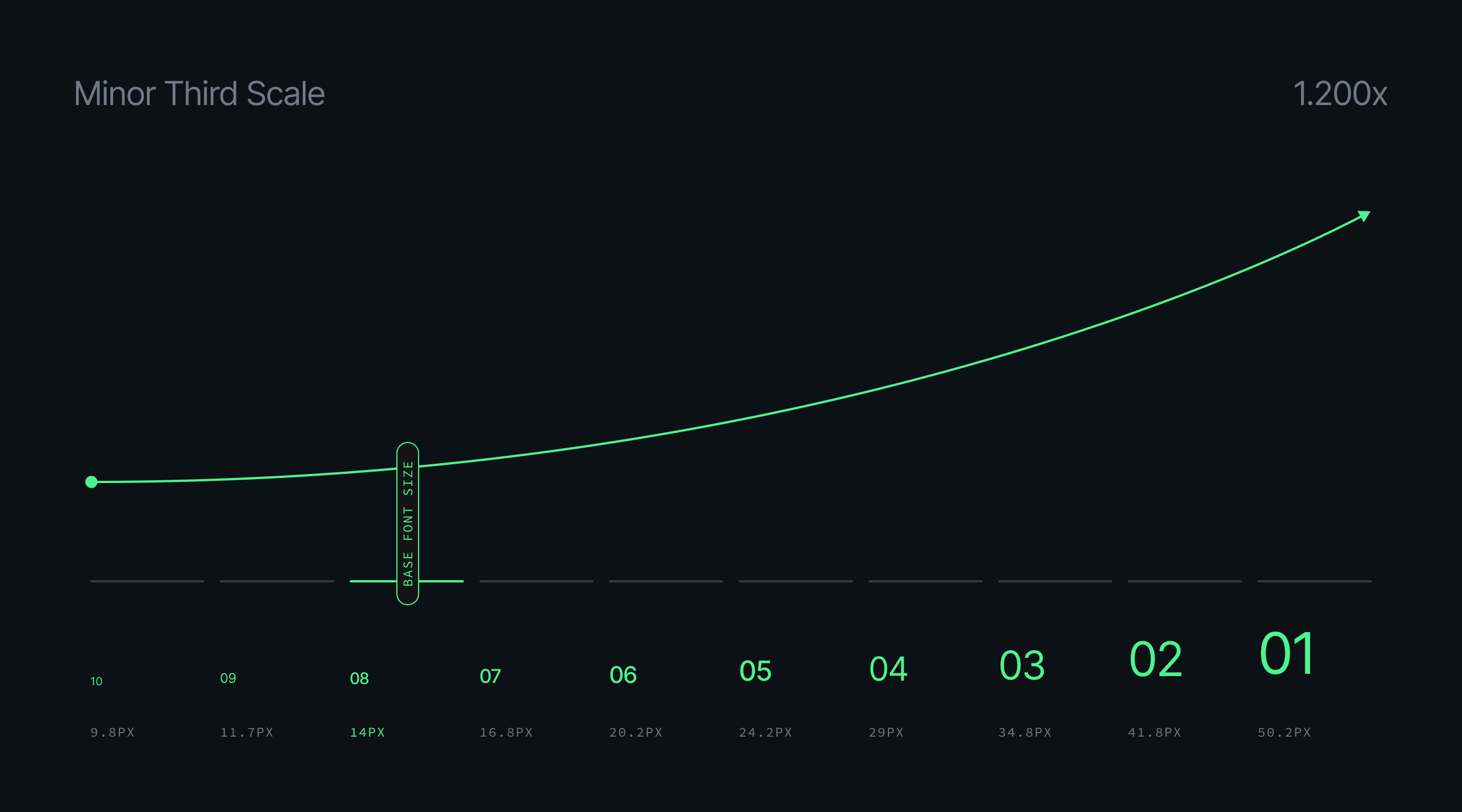
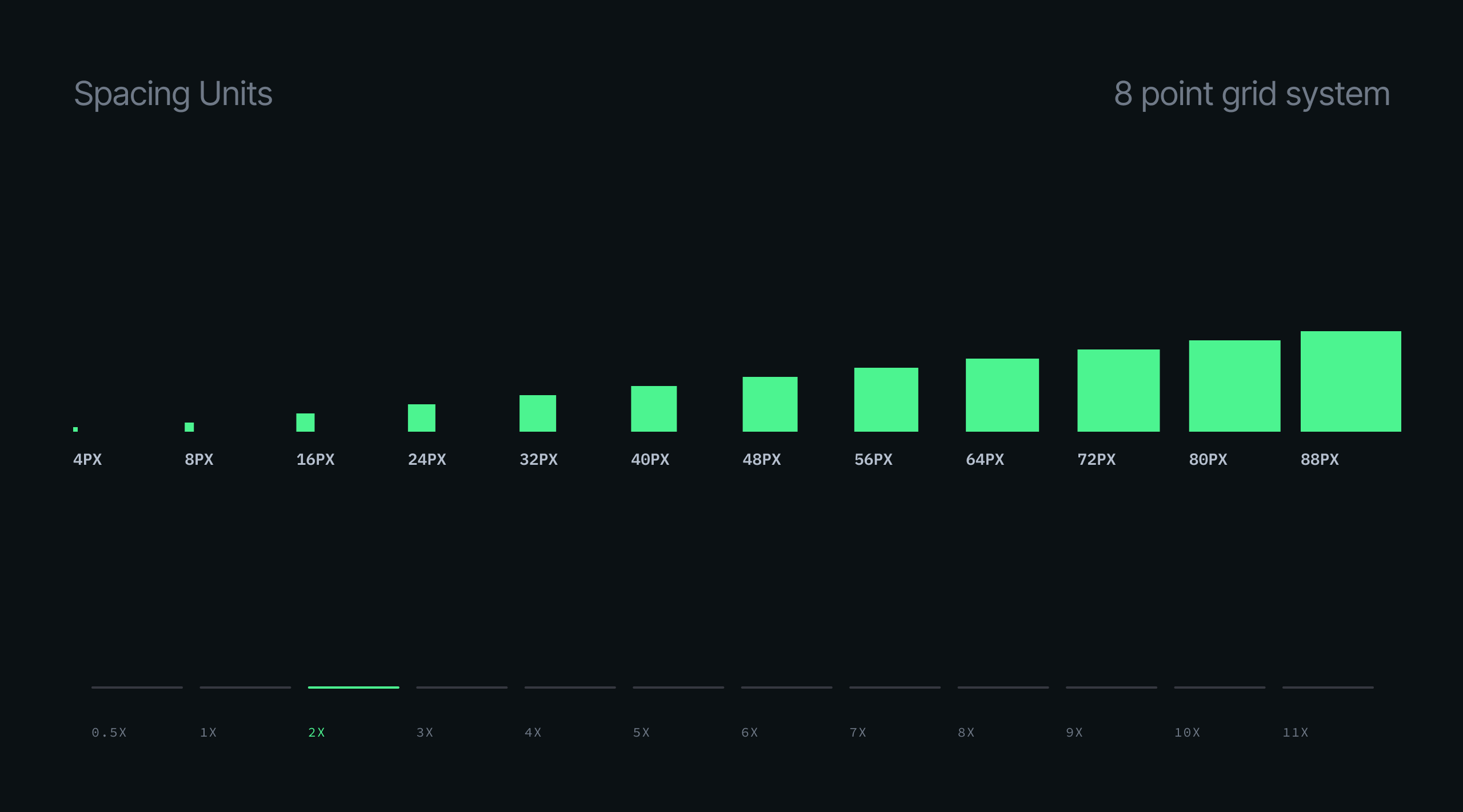
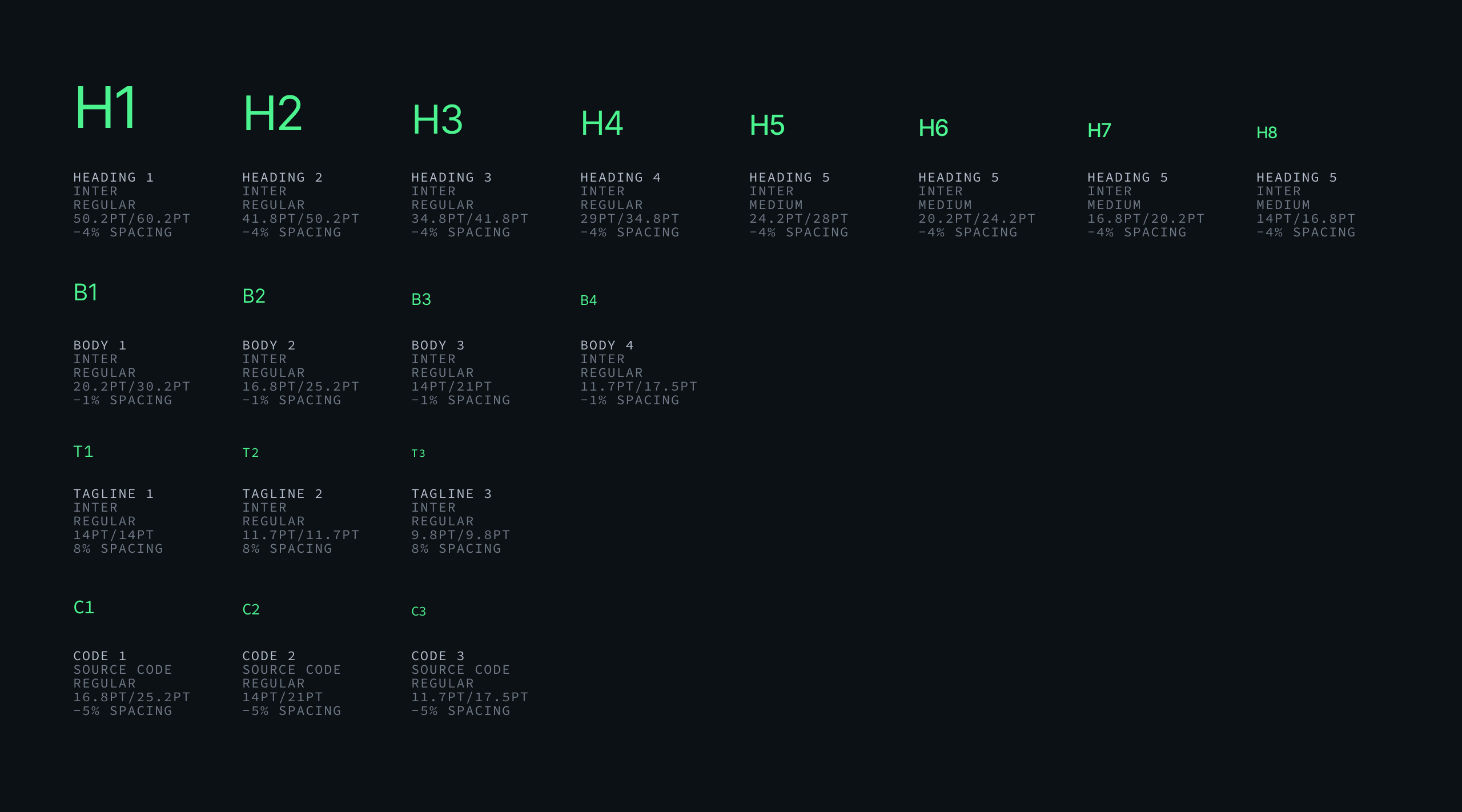
Typography & Spacing

I introduced a formal typography and spacing system designed for dense developer tooling.


14px Base, 1.200 Scale
Dense screens such as tables, metrics, and code views require clear hierarchy at small sizes. A minor third scale from a 14px base provided that structure without oversized headers competing with the data.

Consistent Type Styles
Defined styles for headings, labels, body, caption, and code so every surface could draw from the same system.

Spacing via 8pt Grid
An 8pt grid brought consistency to component spacing and layout gaps, especially in tables and metrics where dense layouts make inconsistency immediately visible.
Image 1
Image 2
Image 3
Image 4

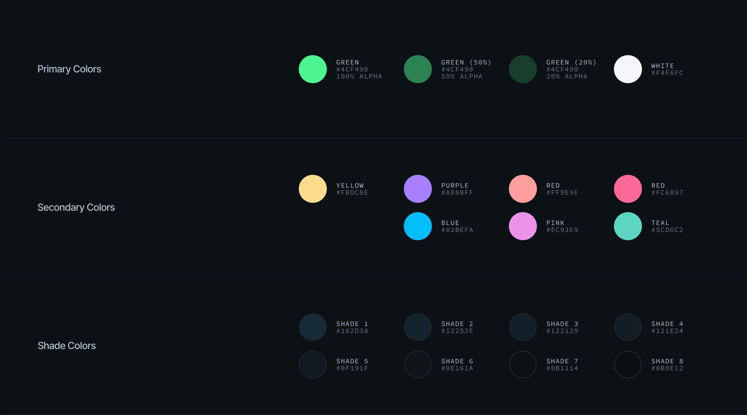
Visual Language & Color

I refined the brand in three areas that had the greatest impact on cohesion and usability.


Radial Patterns
The brand included a radial motif in the hero, but it had not been extended elsewhere. I developed it into a broader library used throughout the portal and related surfaces.

Color Recalibration
Near-black on near-white created unnecessary strain during extended reading. I shifted the neutrals lighter with a cooler tone, preserving the dark aesthetic while allowing the green accent to feel more natural.

Component Sizing
Buttons and controls were sized for dense screens, smaller than typical interfaces but proportionate to the data they sit alongside.
Image 1
Image 2
Image 3

Outcome

The result was a shipped portal and a design system the team could continue to build on.


75,000+
Registered Users
Strong developer adoption for an early-stage infrastructure product.

A Portal Built for Developers
Delivered as a complete product experience, from first login through day-to-day database management.

A Formalized Visual System
Established typography scales, spacing rules, color roles, and component patterns that designers and engineers could build from.

Ongoing Ownership
I continue to drive design direction across product and brand as SpacetimeDB grows.
arrow_back SpacetimeDB at Clockwork Labs ios_share